The founder of eponymous architectural and interior design studio, Alice Gyllenkrok takes us on a tour of her latest project in Notting Hill that is redefining mews houses.
When you enter a home designed by Alice Gyllenkrok’s, you are immediately struck by a masterful balance of striped back, refined architecture with bold, eclectic and colourful interiors. Alice designs homes to function as a home, placing an equal importance on both the aesthetics and functionality. Often working as both the architect and interior designer on her projects, she creates a cohesive flow throughout her projects, which have a carefully considered, yet relaxed dynamic.
Alice grew up with a deep understanding and appreciation for aesthetics and layout, which was instilled in her from a young age. As a child Alice would pay close attention to her mother, a successful interior designer, who would frequently update and change the interiors in their home. However, moving away from her formal training as an architect (at both the Royal Academy of Fine Arts in Copenhagen and the Architectural Association in London) Alice set up her own jewellery brand in 2013, which was financed by design projects that she undertook on the side. However, her unmistakable design talent attracted increasingly big residential projects, so Alice eventually decided to focus her efforts on starting her own studio.
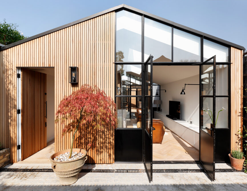
Alice’s recent refurbishment project in Notting Hill is a charismatic home, that has been completely reimagined to challenge every outdated perception of a mews house. A dynamic split-level home, bathed in light and interspersed with an eclectic mix of mid-century furniture and curated art. Alice walks us through her design journey, and how she created this engaging, dynamic home.

How did you start your journey to becoming a designer?
I grew up in Luxemburg and Sweden where my mom was an interior designer. She was constantly changing things and moving furniture around and I have emulated that behaviour since I was a child. I went on to study architecture at the Royal Danish Academy of Fine Arts School of Architecture in Copenhagen and then at the Architectural Association in London, before taking a detour to work in fashion and start my own line of jewellery.
When did you start your studio?
I started a jewellery company in 2013, which I financed through doing small refurbishments on the side. As these projects grew in scale, the jewellery business took a back seat and my studio became a reality.
How would you describe your aesthetic?
Eclectic, refined yet warm. I love the simplicity of great materials coupled with interesting furniture pieces from all eras.
Would you say you have a signature style?
I would say my style is quite pared back, but not afraid of colour, which might sound like a bit of an oxymoron, but rings very true in the work that I produce! In the layouts I create I always work towards light. That is non-negotiable for me. You would be hard-pressed to find any long dark corridors in my projects.
You’re a talented architectural designer and interior designer, which must to some extent make it much easier to marry up the two on the projects that you work on. How would you describe the relationship between architecture and interior design in a home?
The relationship between architecture and interior design is a symbiosis. Great architecture is enhanced through beautiful pieces and beautiful objects need to be showcased in the right place to really be appreciated.
My client was my main inspiration and the vision he had for his life in this house, as well as some art and antiques he wanted to bring with him.
- Alice Gyllenkrok
Who or what influences your designs the most?
The client, how they would like to use the space, what their day to day life is like, that is always my first point of inspiration. Aesthetically I tend to gravitate towards Axel Vervoordt, Vincent Van Duysen, Rose Uniacke, Luis Barragan and Atelier AM.
Your residential project on Pembridge Mews is wonderfully finished. What was it like when you first started the project?
Before we started the refurbishment, the place had a very “early Apple store aesthetic”. There was a lot of chrome, glass and ceramic wood tiles. We changed most of the layout and reconfigured how the space was used.
What influenced and inspired you during the design process?
My client was my main inspiration and the vision he had for his life in this house, as well as some art and antiques he wanted to bring with him. It was a very collaborative project.
What were your main goals in what you wanted to achieve for the space?
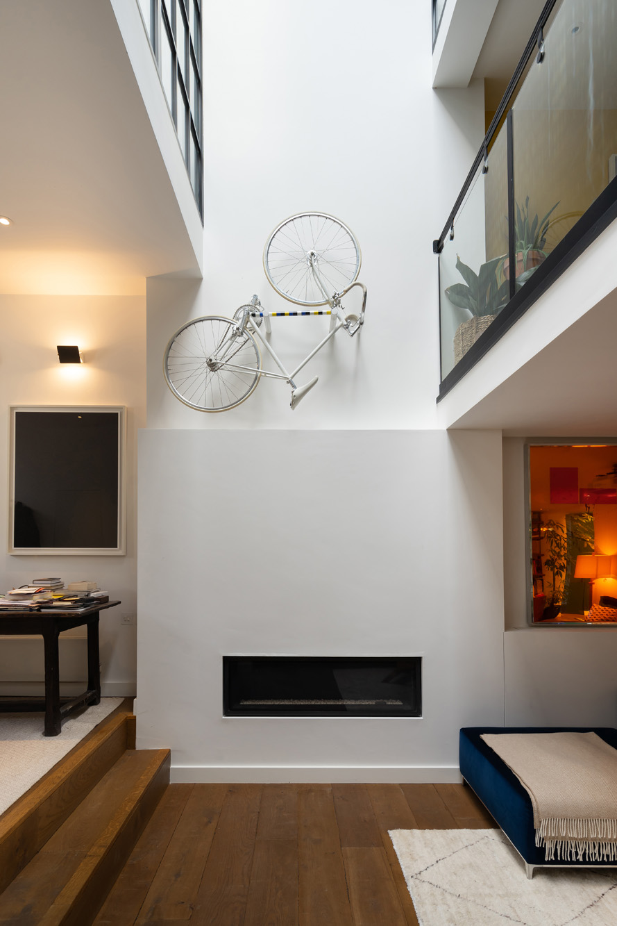
To make it more cohesive yet cosy. It’s a very unusual space, in the sense that it consists of areas that are double even quadruple height. Baring that in mind, it was important to us to still make it feel relaxed and unimposing.
How did you balance working as both the architect and interior designer on this project?
I prefer working in both roles, as it’s the best way to generate a truly great end product and they naturally feed into each other. It’s a reinterpretation of the idea that form follows function. The function of a wall can, for example, be to have the right dimensions for a particular dresser to be in front of it.
Did your plans for the architecture dictate the interior aesthetic or vice versa?
It worked both ways.

I’m sure there are challenges when it comes to redesigning a mews, namely size restrictions. How did you overcome any of the challenges that you found?
The mews is quite spacious, so we didn’t really face a lot of size restrictions. The main challenge was understanding how my client wanted to live in his house, which is more untraditional than the run of the mill homeowner.
You’ve created a real sense of space and light. Was this important to you when redesigning the home?
Yes, light my main driver and passion.
How would you describe the interiors?
Colourful, unfussy and eclectic.
There are some very bold colour choices throughout the home. How did you chose the colours for each area?
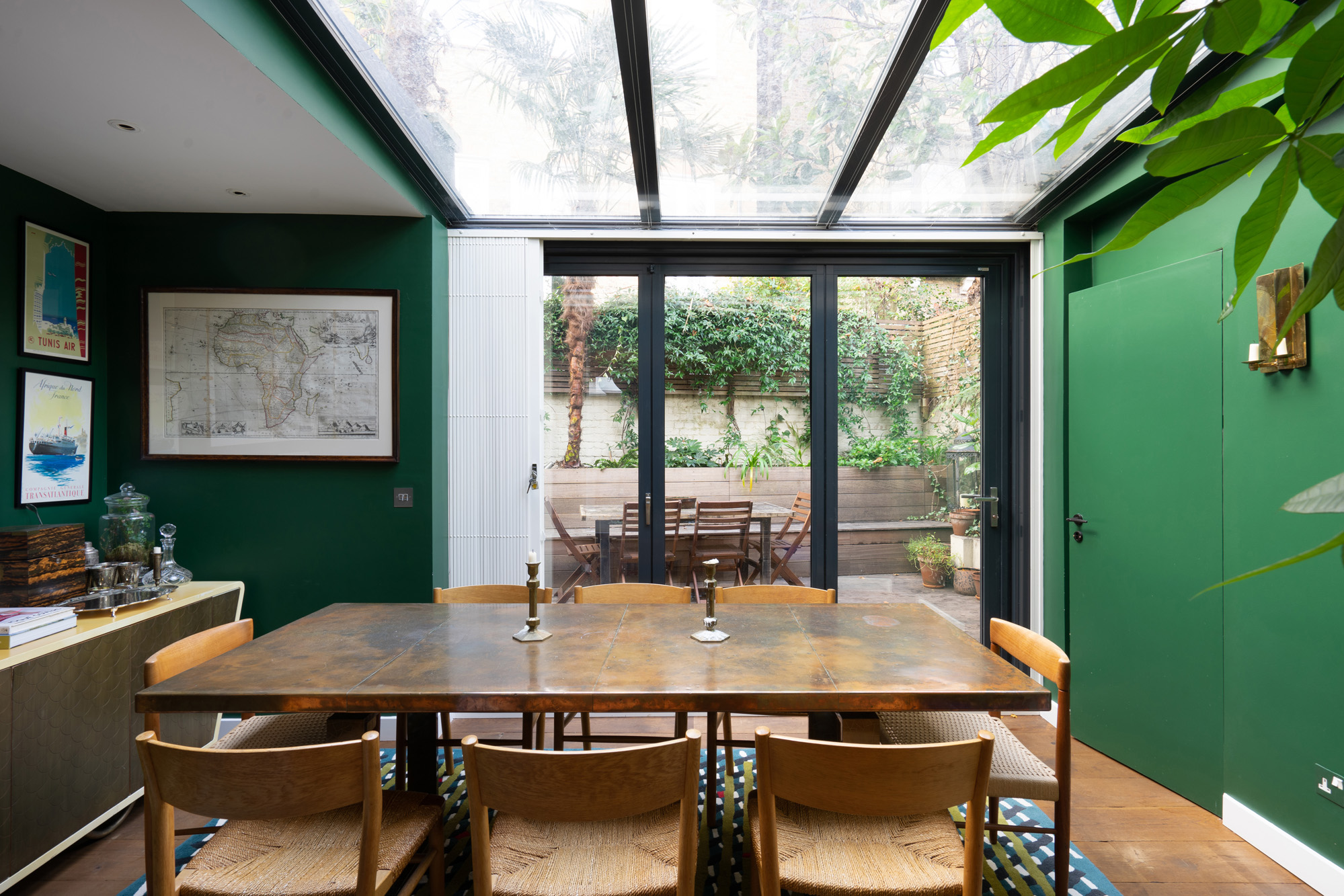
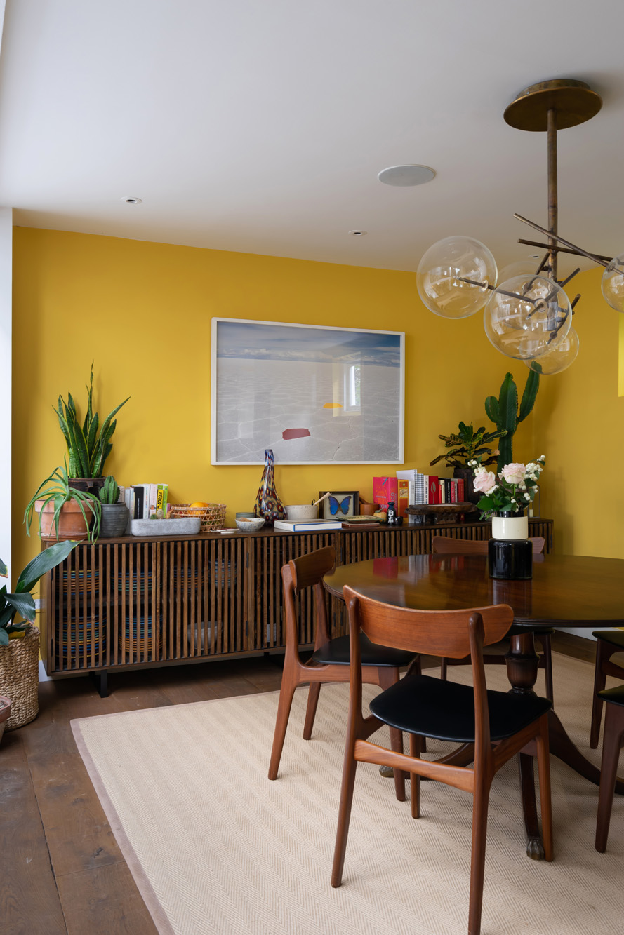
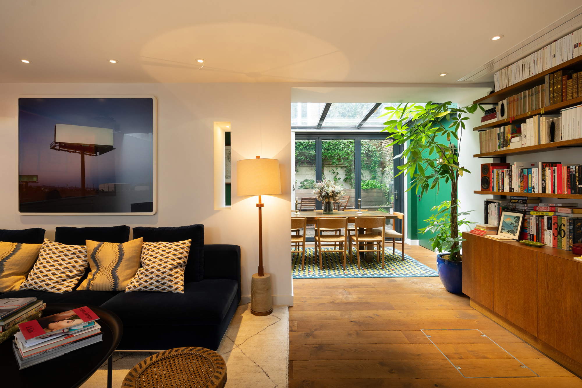
The colours manifested themselves while we were working on the project. My client really wanted a yellow kitchen, the calke green added a much-needed serenity to the master bedroom. The green in the back of the ground floor helps focus the eye on the window and the outside space.
How do you want people to feel on entering?
I would hope they feel surprised and excited by the unusual scale of this mews house, then relaxed and at ease.
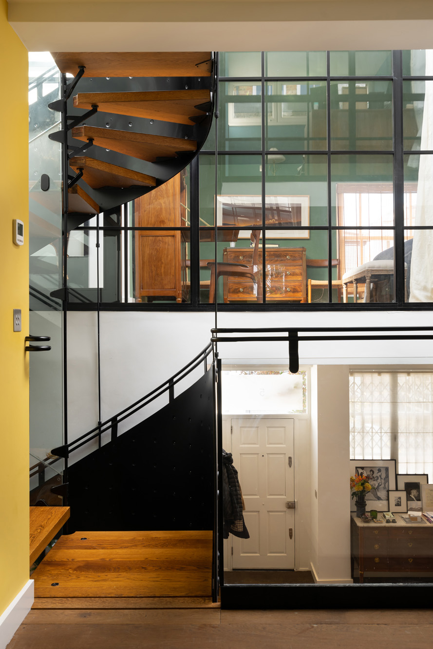
The staircase and skylight is truly extraordinary, especially featured in a mews house. Please could you tell us more about how the design for this evolved?
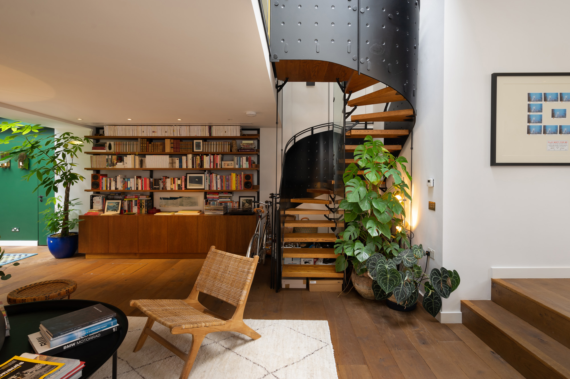
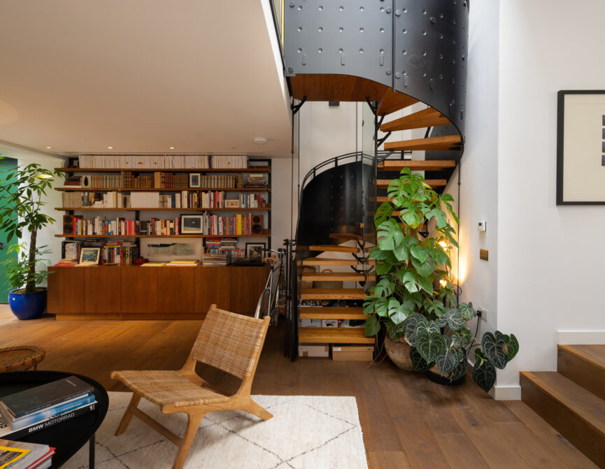
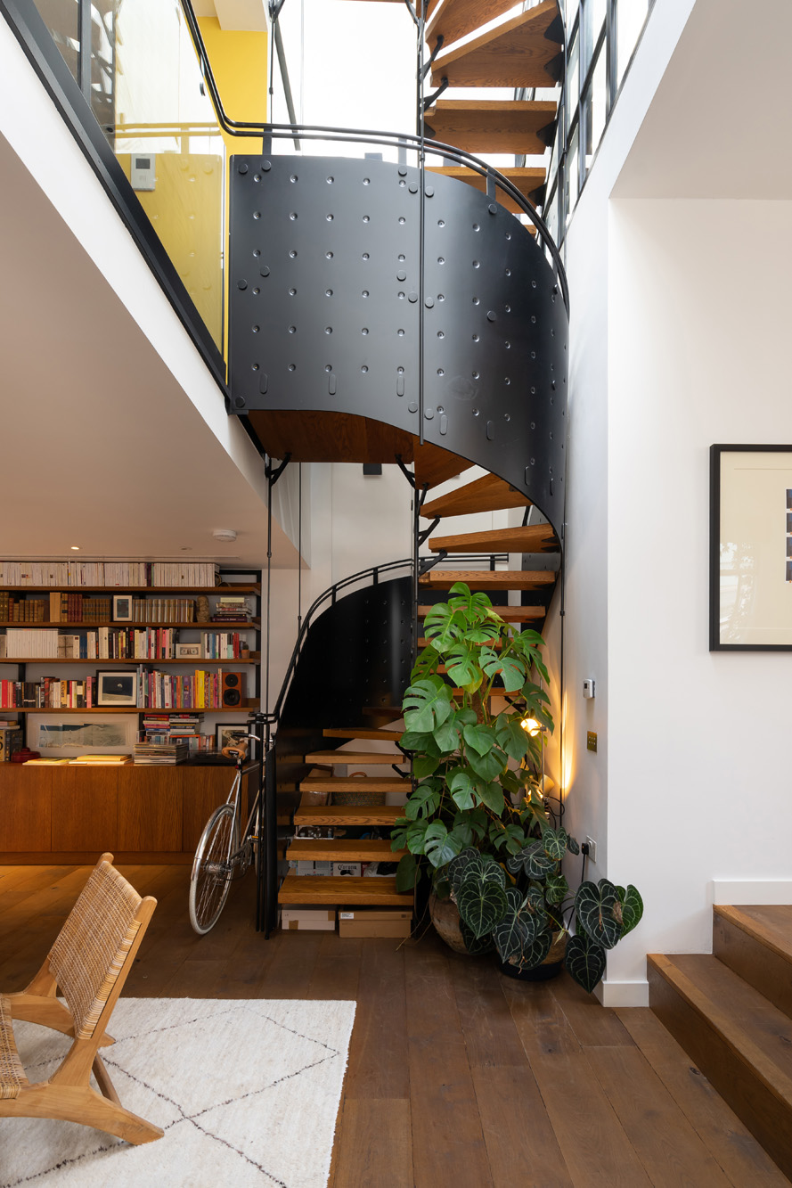
The staircase already existed when the client bought the house. It was in chrome with glass steps which felt quite dated, so we changed the treads to wood and sprayed the main part black to match the glazing bars we had added to the internal windows.
Is there a space or design detail in the house that you are proudest of?
I love the way the big windows in the master bedroom turned out.
