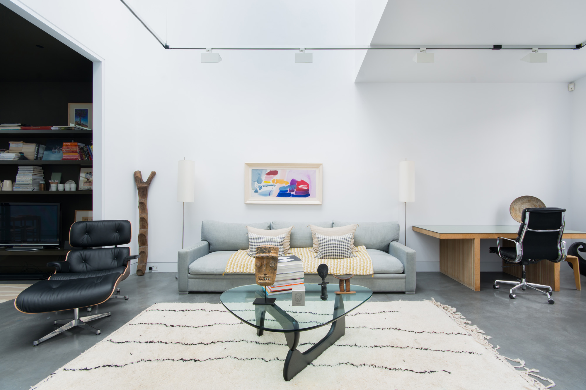
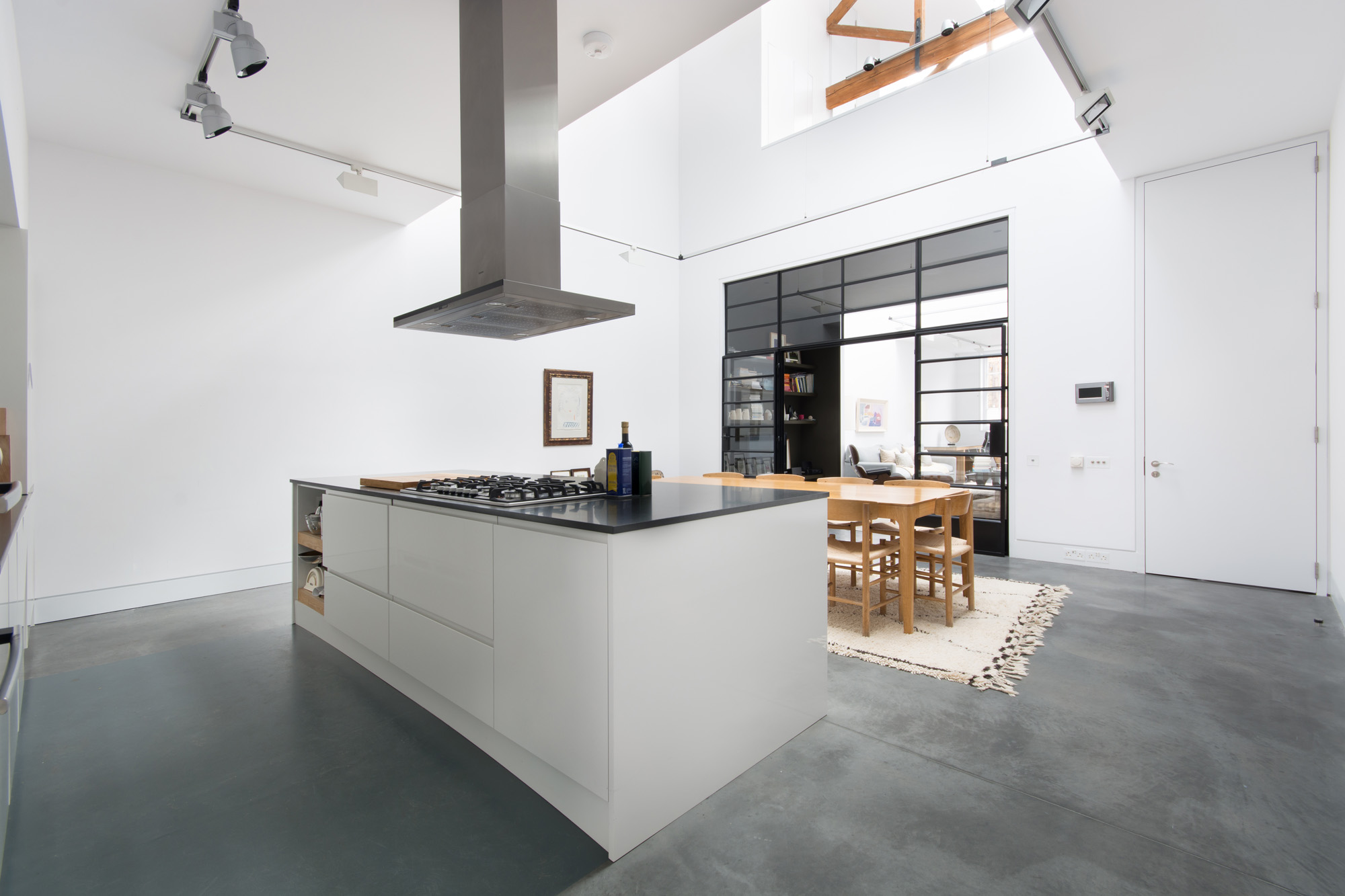
A gallery-like conversion in North Kensington belonging to part of a building that was once a Victorian dairy.
Restored by developers CVP Designs, the building was divided up to be sold as five separate working/living units in 2000. Leaving the integral architecture intact, the developers gave a new lease of life to the original shell of the building, re-painting the brickwork and replacing the original sash windows and skylights with new ones. Everything else concerning design and build however, was left to the fate and design eye of the consequent owners – who did a tremendous job of refining, customising and evolving the space over a period of 17 years.
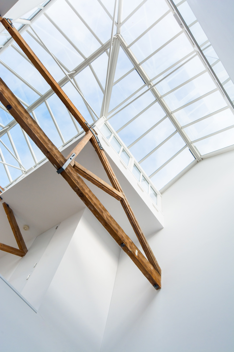
The previous owners were drawn to the property because with its triple-height ceilings, it was the perfect spot to set up a studio and exhibition area for two artists, as well as substantial accommodation on the top floor. “The huge volume – the feeling of space – was immediately impressive. The scale, the natural light, the opportunity to start from scratch, these were all very exciting.” They then enlisted close friend and architect Theo Otten of Otten + Partners to help then with the first major rebuild. “When we bought it there was just a rough concrete floor, the walls were unpainted brick and the original Victorian wooden trusses were exposed. We decided to keep that light industrial aesthetic.” Because back then, the primary function of the home was as a work rather than a living space – a place to create and display artwork – the initial renovation was very light-driven. ERCO lighting was used throughout and glass-sided gangways were introduced upstairs to maximise the sunlight filtering in through the vast vaulted skylights. Large storage rooms were built in downstairs so that painting materials could be moved out of sight during exhibitions.
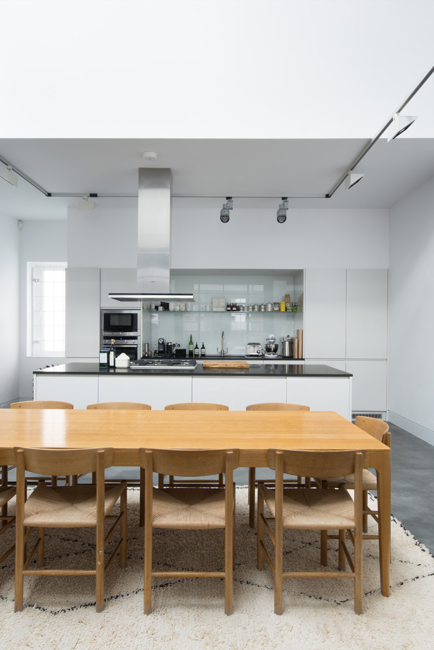
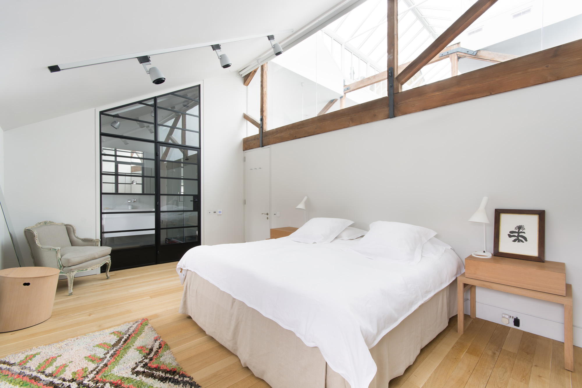
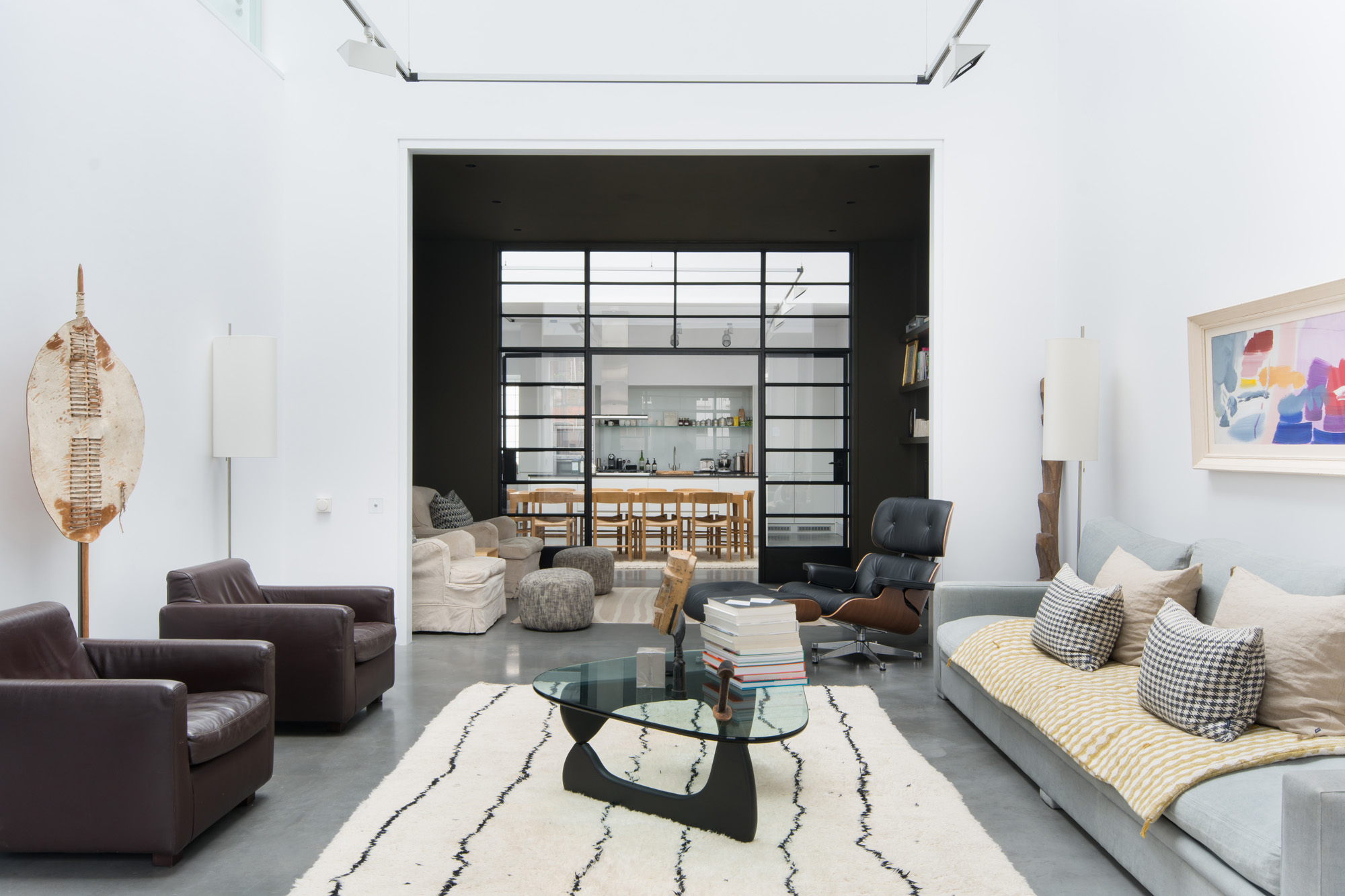
As the owners’ needs changed over the years and they began to spend more time in London, a second renovation was implemented in 2014 – bringing Theo Otten back to redevelop the space accordingly. A large modern kitchen was installed on the ground floor, and one of the storage rooms was converted into a laundry room. The second storage room that divided the two art studios was opened up on both ends and refitted with striking Crittall doors, whose dark, linear features provide a clever shift mechanism between the dark-walled TV room/den and the expansive light spaces (kitchen/dining and living) ether side. Without compromising on the warehouse feel, the upper level was extended upon to add another bedroom suite connected by a gallery whilst keeping half of the space open to the ground floor.
Building materials and finishes were carefully chosen to fit with the light, industrial aesthetic – wood, polished concrete floors, glass and industrial light fittings. The previous owners wanted to keep as much light as possible flooding down from the skylight so as to preserve that uplifting feeling of the large volumes from any vantage point. “We have used a lot of glass: Crittall screens, glass-sided walkways and big internal windows in the bedrooms. We even found a great Tom Dixon pressed-glass light fitting for the ground floor bathroom. A soft palette: warm oak floors, cool white on the walls, warmer pale greys in the kitchen and bedrooms make this a calm and open space.” The result of the most recent renovations is spectacular. True respect for the original building is tangible; the unique space has been artfully milked for every extraordinary architectural moment it could possibly give.
Minimalist at heart, the home has an overwhelming sense of energy. It’s amazing just how well the building has adapted to two very different stages of lifestyle requirements – and indeed just how well it will respond to its next owners’ needs.
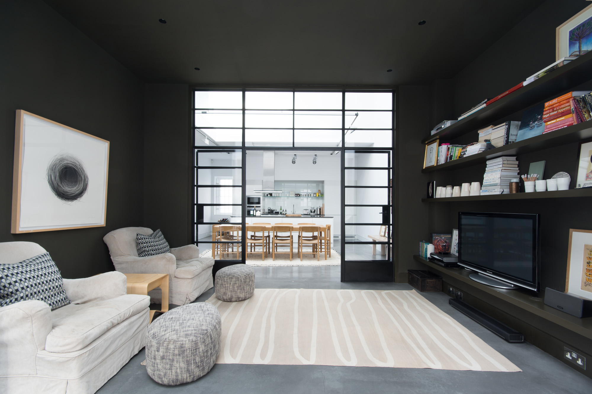
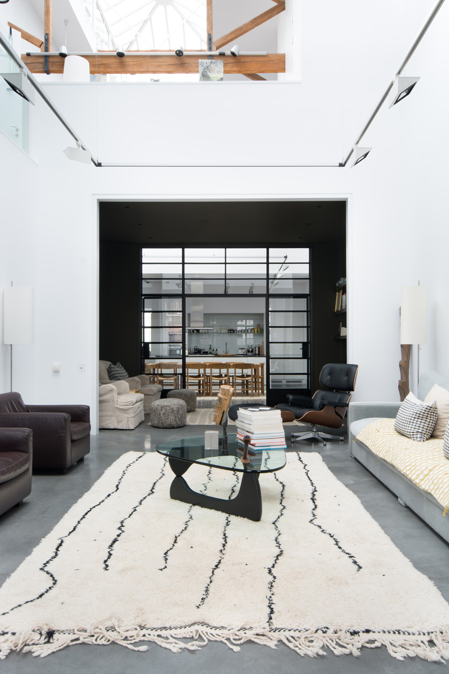
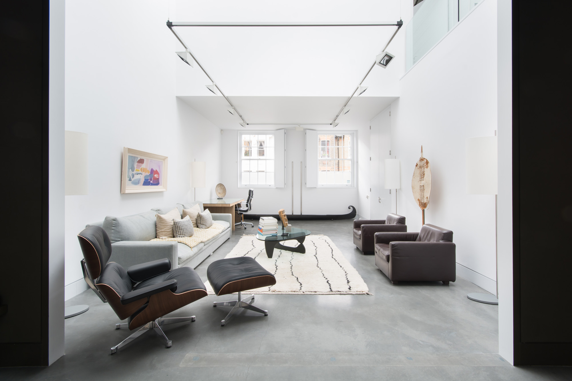
Building materials and finishes were carefully chosen to fit with the light, industrial aesthetic – wood, polished concrete floors, glass and industrial light fittings.
