Duncan Campbell and Charlotte Rey reflect on their 20th century-inspired pieces. Plus, advice on how you can style them in your own home.
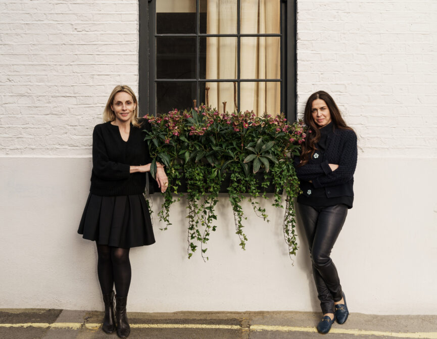
Award-winning design studio Campbell-Rey needs no introduction. The polymathic duo behind the studio, Duncan Campbell and Charlotte Rey, are regular faces in publications including Vogue, Architectural Digest and Wallpaper. On their books? Everything from art direction for Bulgari to opulently dressed interiors for Christie’s. Not to mention a collection of gem-toned Murano glassware and privately commissioned cocktail tables.
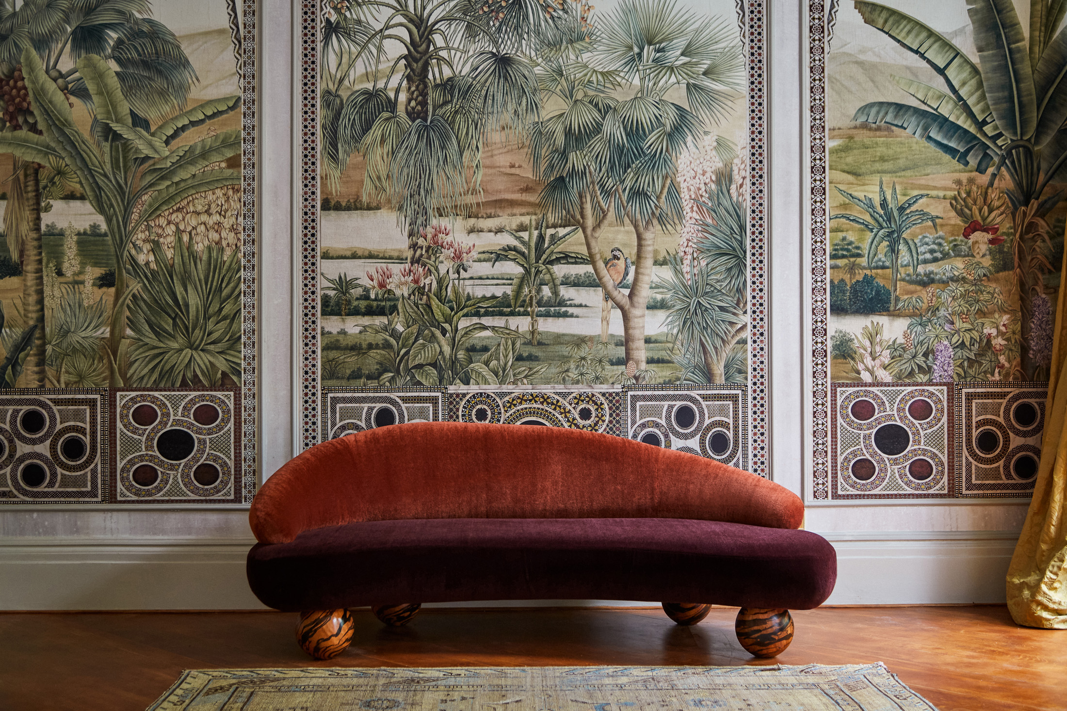
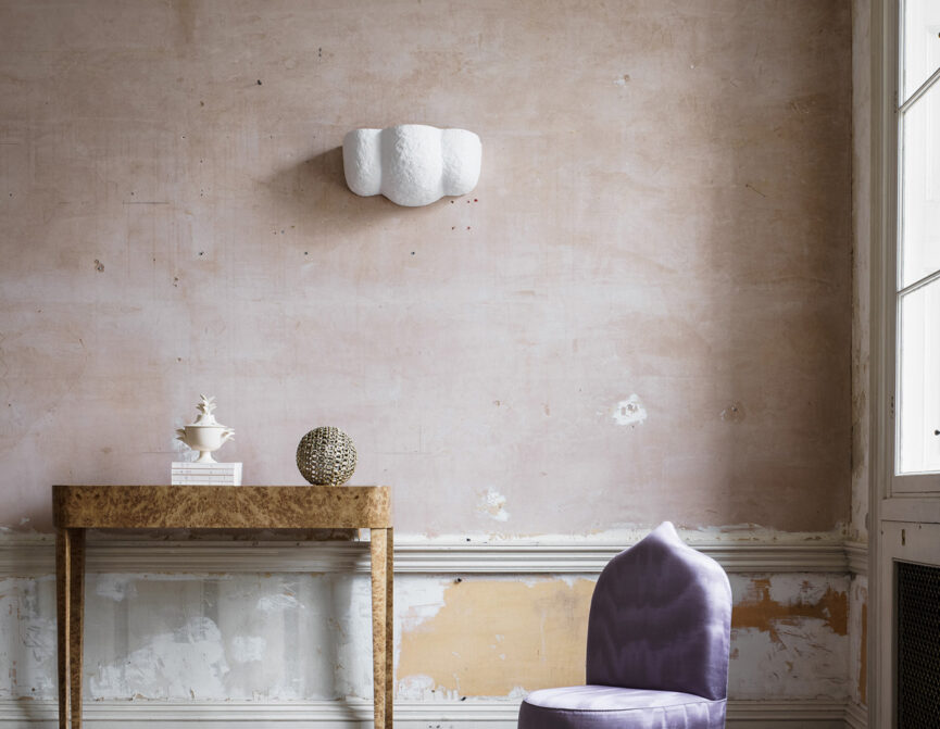
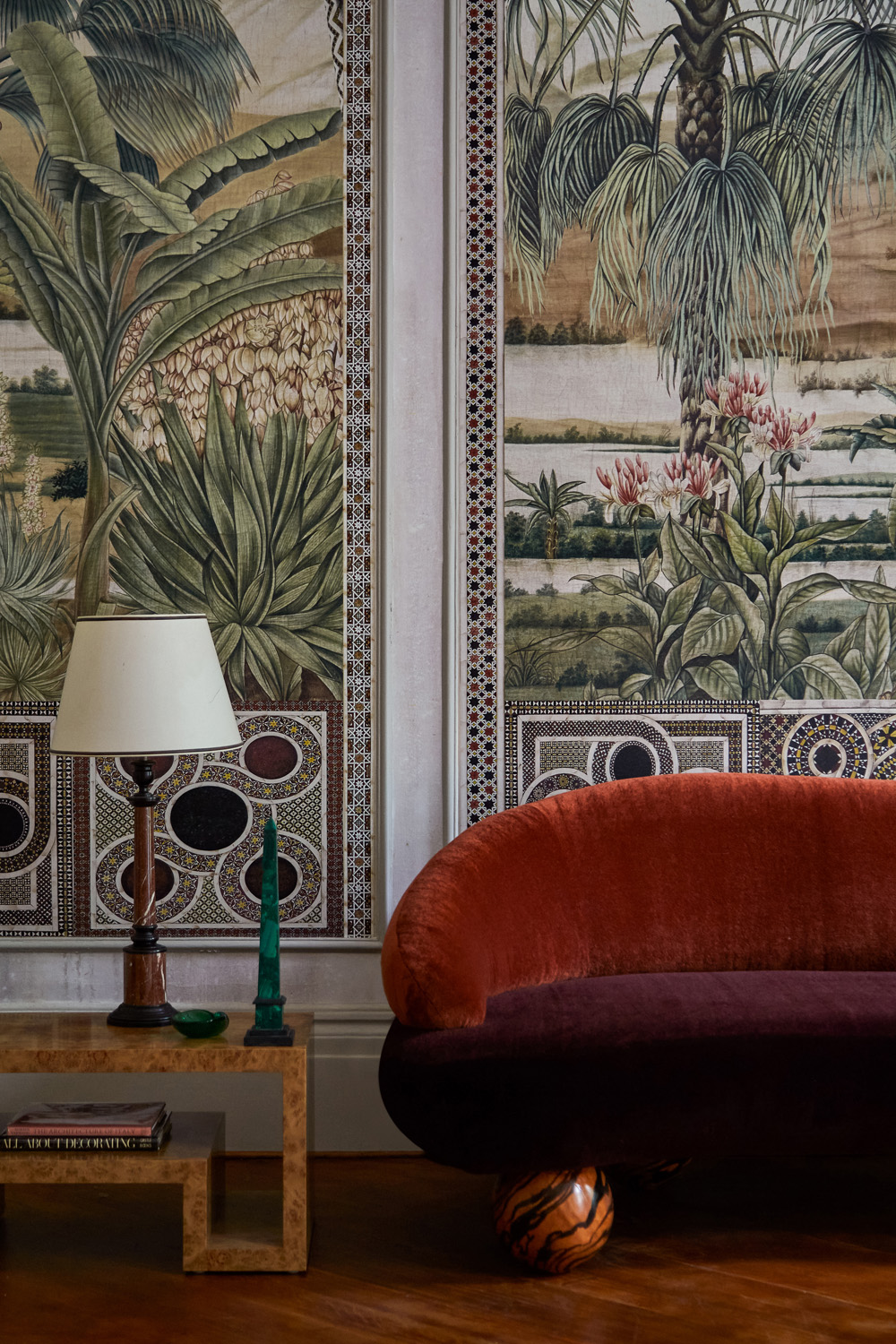
Now, fully transitioned from creative consultancy to design practice, Campbell-Rey’s spaces are as idiosyncratic as their furniture. Playful colours, sculptural shapes and witty references to 20th century art are the only constants in their avant-garde approach – one that’s perfectly expressed in their sculptural, newly-launched range with The Invisible Collection. The line includes a two-toned sofa that echoes 1970s Milanese style, a marigold yellow bench that nods to Secessionist Vienna and a grand Queen Anne mirror with trompe l’oeil tortoiseshell detailing.
Here, Duncan and Charlotte discuss their design influences, their creative process and the spirit of conviviality that their statement furniture embodies.
You’ve designed furniture in the past, like Thierry collection of cocktail tables in 2017, but this is your first official collection. Was it always in the pipeline that you would release your own line?
Charlotte: Yes, because we’ve always been fascinated by furniture and interiors. Over the past few years, we’ve made several one-off commission pieces for clients, but the idea of a collection was always at the back of our minds. Approaching a collection is quite different to designing individual pieces. We’ve always been interested in the challenge of putting together a coherent set that can work as standalone pieces too.
Why did you choose to partner with The Invisible Collection and market your pieces online?
Duncan: We believe that The Invisible Collection is the most prominent marketplace for contemporary collectible design today, so we were thrilled when they asked to represent us and premiere our collection with them.
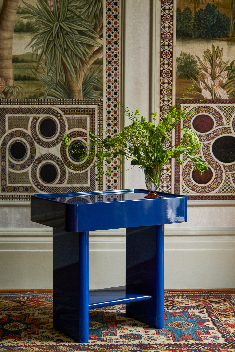
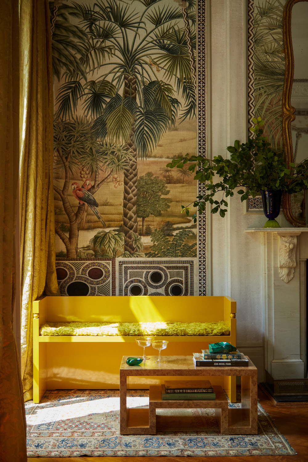

The statement collection is characterised by their “exaggerated forms, modular shapes and rich, tonal colourways”. How would you recommend our readers style them within their own homes?
Duncan: As they see fit. It’s always fun and rewarding to see how other people take something you’ve created and make it their own. Our work is very much about mixing styles and periods and the exciting dialogues this can create. I’d love to see these pieces in a variety of interiors, both historical and contemporary. It would be fantastic to see them juxtaposed next to antiques today, and eventually to become heirlooms themselves in the future.
These 12 pieces of your collection are a reimagining of some of the best of 20th-century European design. How did you whittle your line down to 12 pieces?
Duncan: It was incredibly hard, but good and fun hard. A huge part of our job is to see new things, turn them upside down and inside out, understand how they work and how they feel, and when we do, they might inspire us in one way or another, but this is a constant dialogue we share. Editing is a very important part of our work at every stage, to make sure the resulting output is as good as it can be. Some pieces get filtered out because they don’t feel as strong, some things prove to be very difficult to make or not commercially viable and some things can be finished but then they simply don’t make the cut. We are both very discerning, so if we both don’t love it then it goes. Often, we know something is right if we both love it from the outset.
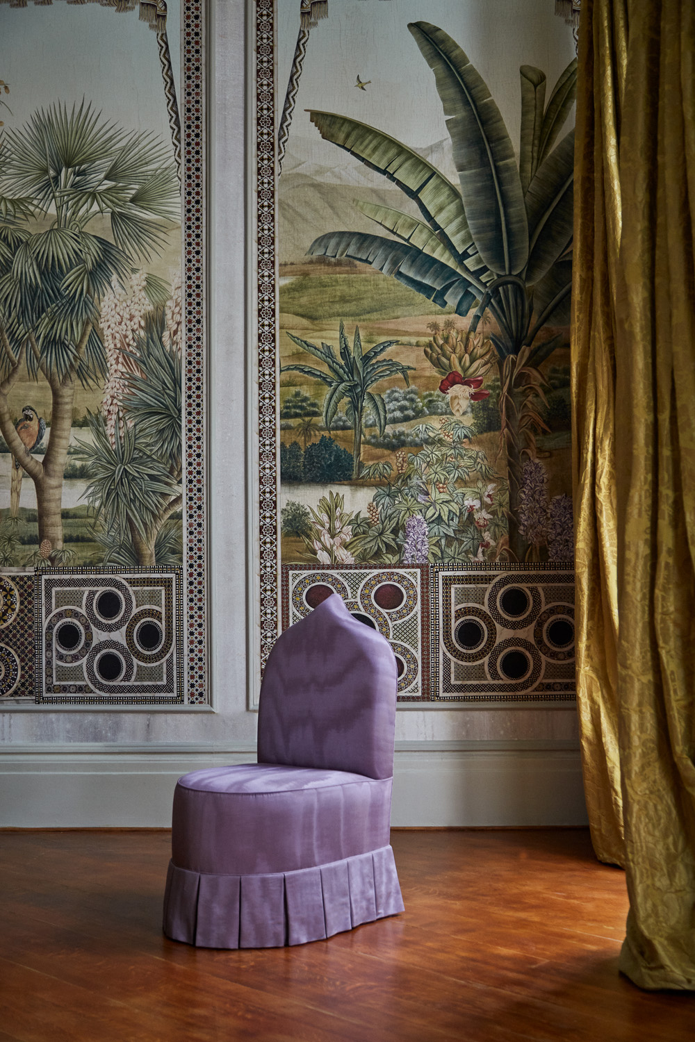
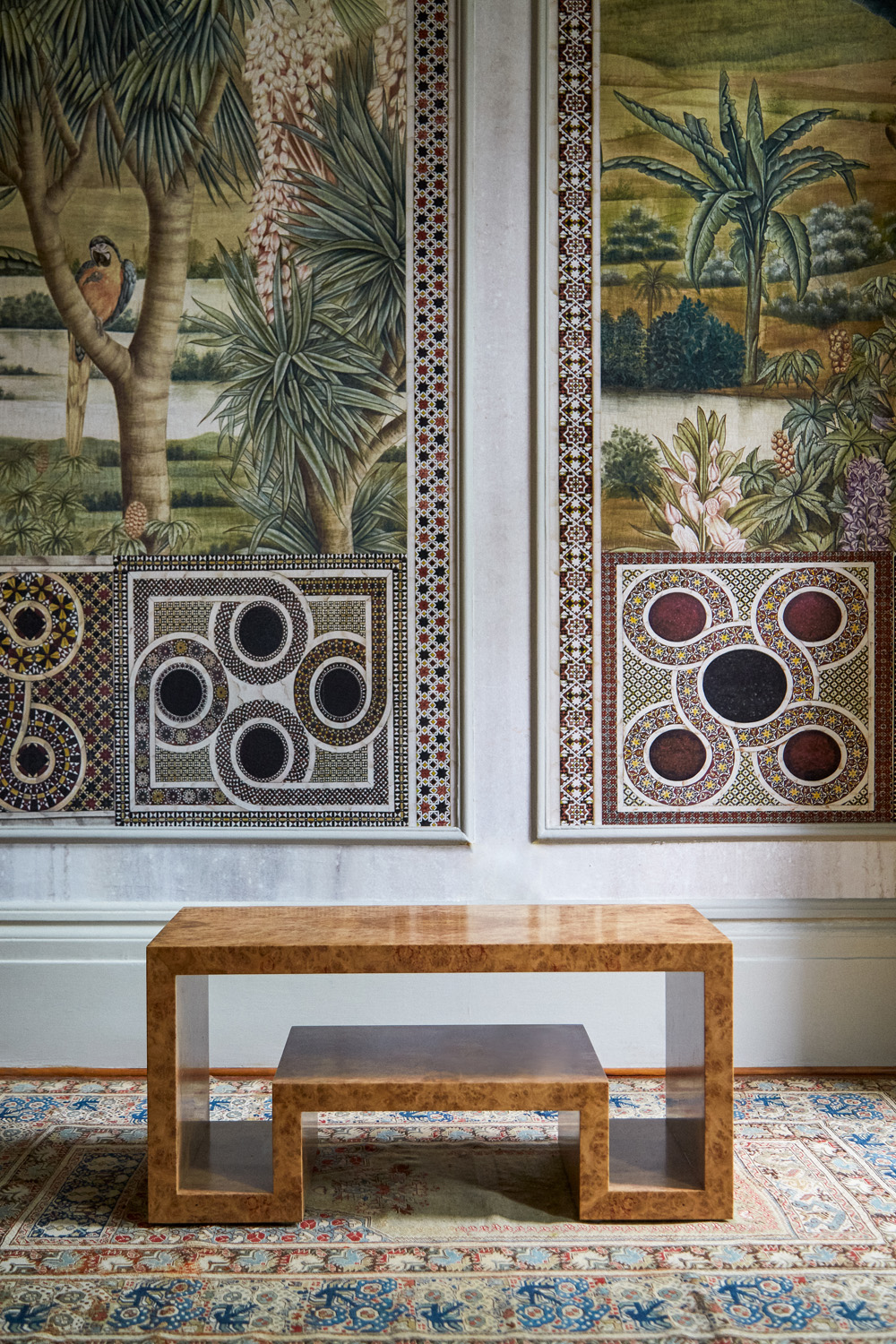

Why did this century resonate and what designers in particular influenced your collection?
Duncan: The tradition of decorative arts that defined this era in Europe really resonates with our continental roots, but our influences are quite varied. We’ve found inspiration in the crafted, detailed work of the Weiner Werkstätte and in the beliefs of one of its founders —architect Josef Hoffmann – that materiality and decoration are essential components of objects and interiors. Our collection has also been shaped by the refined designs of interior designer Jean Michel Frank and furniture designer André Arbus. We also love architect Josef Frank’s uncanny ability to craft his own universe, one that feels as modern and relevant today as it did a hundred years ago.
Charlotte: We are often drawn to the fantastical in both the natural and cosmic worlds. Someone like Italian architect Piero Portaluppi, who integrated astrological details into his work, as seen in the sundial niche at his home in the Casa degli Attelani or the star-shaped window at Villa Necchi Campiglio in Milan, is also a big influence. It’s a fascinating century in so many ways but from our perspective, it’s really when engineering and manufacturing met beauty and creativity, resulting in this wonderful cross-pollination of performance, storytelling and individuality.
If you could showcase this collection in a physical space anywhere, where would you choose?
Charlotte: At Portaluppi’s Villa Necchi Campiglio. It’s definitely the spiritual home of our design practice. We went together when we first attended the Salone del Mobile furniture fair several years ago, and it changed everything.
Meticulous detail and craftsmanship are the foundations of your pieces. How do you source the makers you work with?
Duncan: It depends. Most of them are word of mouth and some of them seek us out. If they have the level of skill and finish that we work towards, and are open to trying new ideas, then we will often give them a piece to work on. If it goes well and we are pleased with the result, we go from there. A lot of what we do is about giving a new expression to traditional techniques, so it’s also important the makers are excited about trying to push the boundaries of what’s possible.

You both met while working at Acne Studios – did you immediately recognise a kindred aesthete in one another? How did you build your business from there?
Charlotte: Yes, I think we worked well together from the get-go. We kept each other’s pace and had a very strong understanding and respect for each other. For both of us, it was our first jobs, so we have been learning and developing our tastes, styles and eye together since.
When we first started our company in 2014, we worked mostly in creative and art direction, but we were always fascinated with physical space and what one can do with and within it. We started to slowly pick up more design work and now we’ve decided to focus our business on it.
Your design ethos mixes different periods and styles together. For the inexperienced among us, is there a right way to do this to create a layered home with a story to tell? What advice can you offer to make sure everything comes together?
Duncan: It’s important to think about a room as a symphony. There should be complete harmony. Nothing should steal the show. There’s a great Josef Frank quote when he says “It doesn’t matter if you mix old and new, or different styles, colours and patterns. The things you like will always blend, by themselves, into a peaceful whole.” And this really resonates with us.
We always consider the context and what the house is telling us – are we in a Belle Epoque villa or a glass box in a skyscraper? Is this going to be a couple’s retreat or a house for family parties? We think about the people using the space first and try and find balance from there. New spaces need older elements to bring a feeling of warmth and patina, while historical interiors can be very exciting when infused with contemporary and unexpected features.
Charlotte: Don’t get too concerned with finding a perfect match. Instead, try to think about whether they create a sense of harmony, or perhaps a surprising juxtaposition. Also, most importantly of all, don’t take it too seriously. Designing a room is a process so don’t forget to enjoy it.


