Inspired by historic settings and timeless palettes, the interior designer introduces her characterful new paint collection.
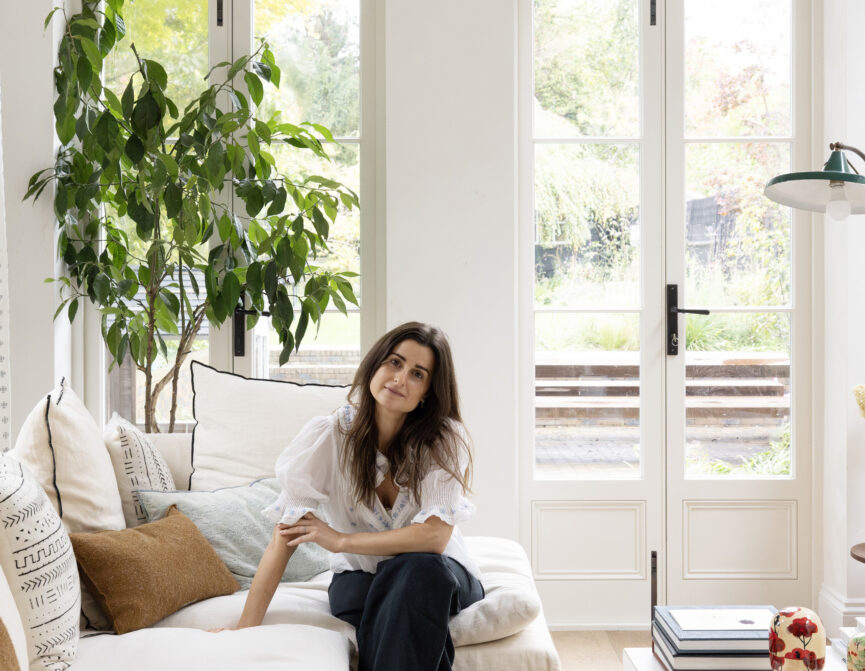
It’s safe to say that colour has made a comeback. Far from the days of monotone beige, today a kaleidoscope of shades adds flair to our homes. But for interior designer Beata Heuman, colour isn’t just a finishing touch or trend – it’s a fundamental.
It’s a language in itself, capable of shifting a mood, setting a scene, or defining the essence of an environment. Beata’s signature style is unmistakable: a balance of playful and sophisticated. Under her watch, bold tones are effortlessly integrated so that spaces sing with personality.
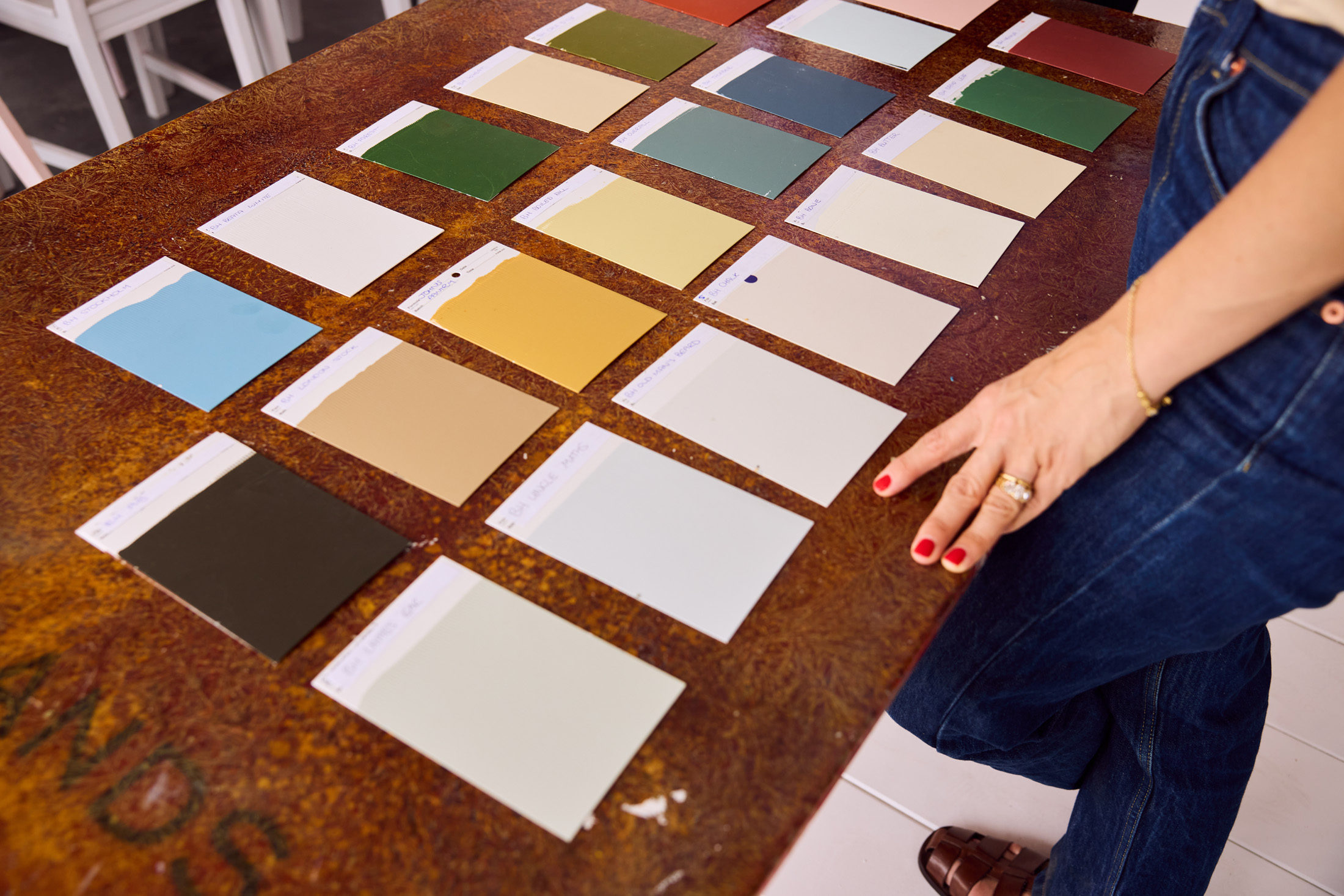
Her latest project, a curated palette of 24 hues crafted in collaboration with London’s oldest family-owned paintmakers Mylands, is an extension of that philosophy. “Colour is one of the most powerful tools in design,” she explains. “Whether your budget is limited or limitless, it doesn’t have to be about how much you spend, it’s how carefully you consider spaces. I still get a thrill seeing small additions make such a huge difference.”
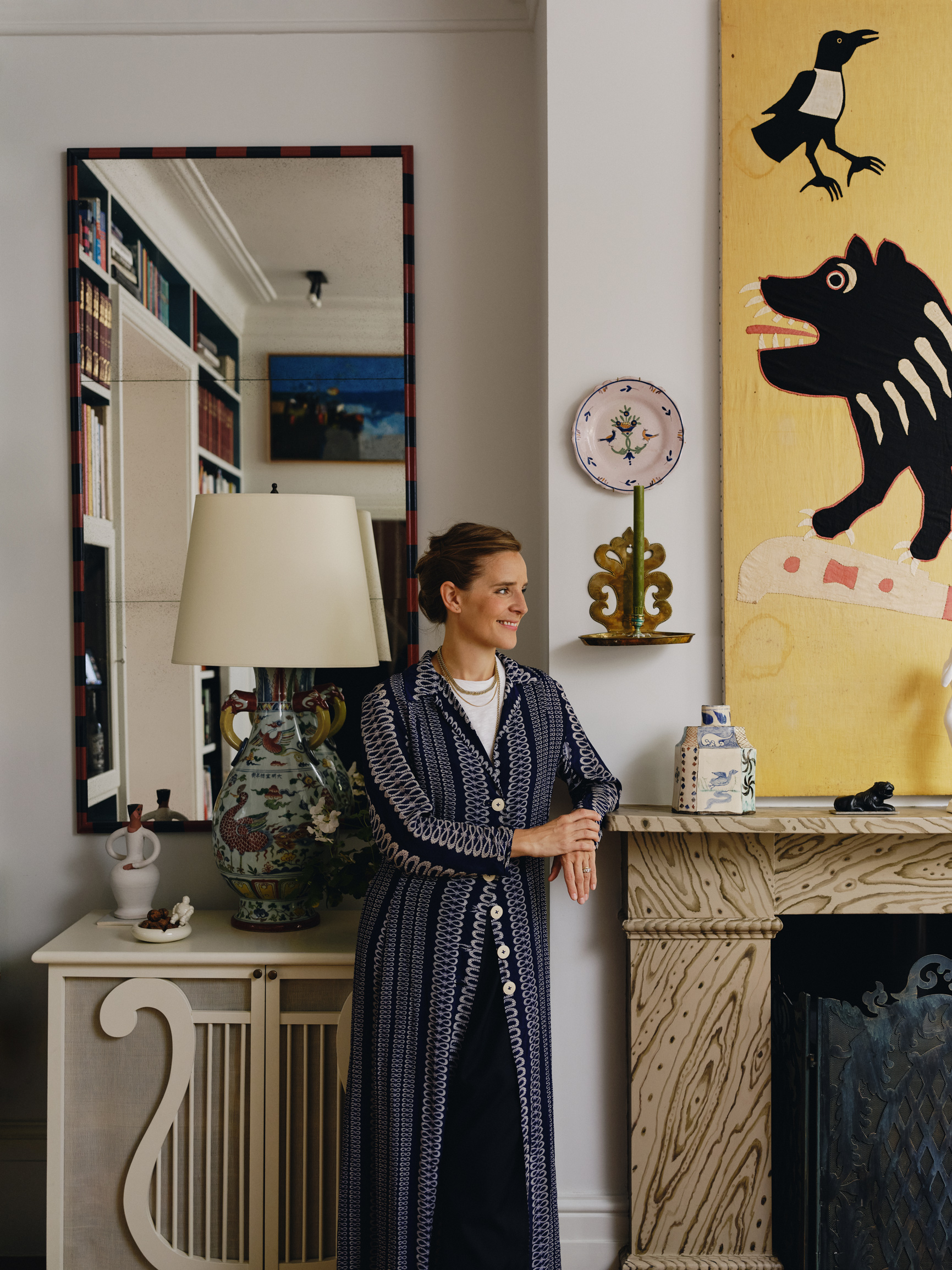
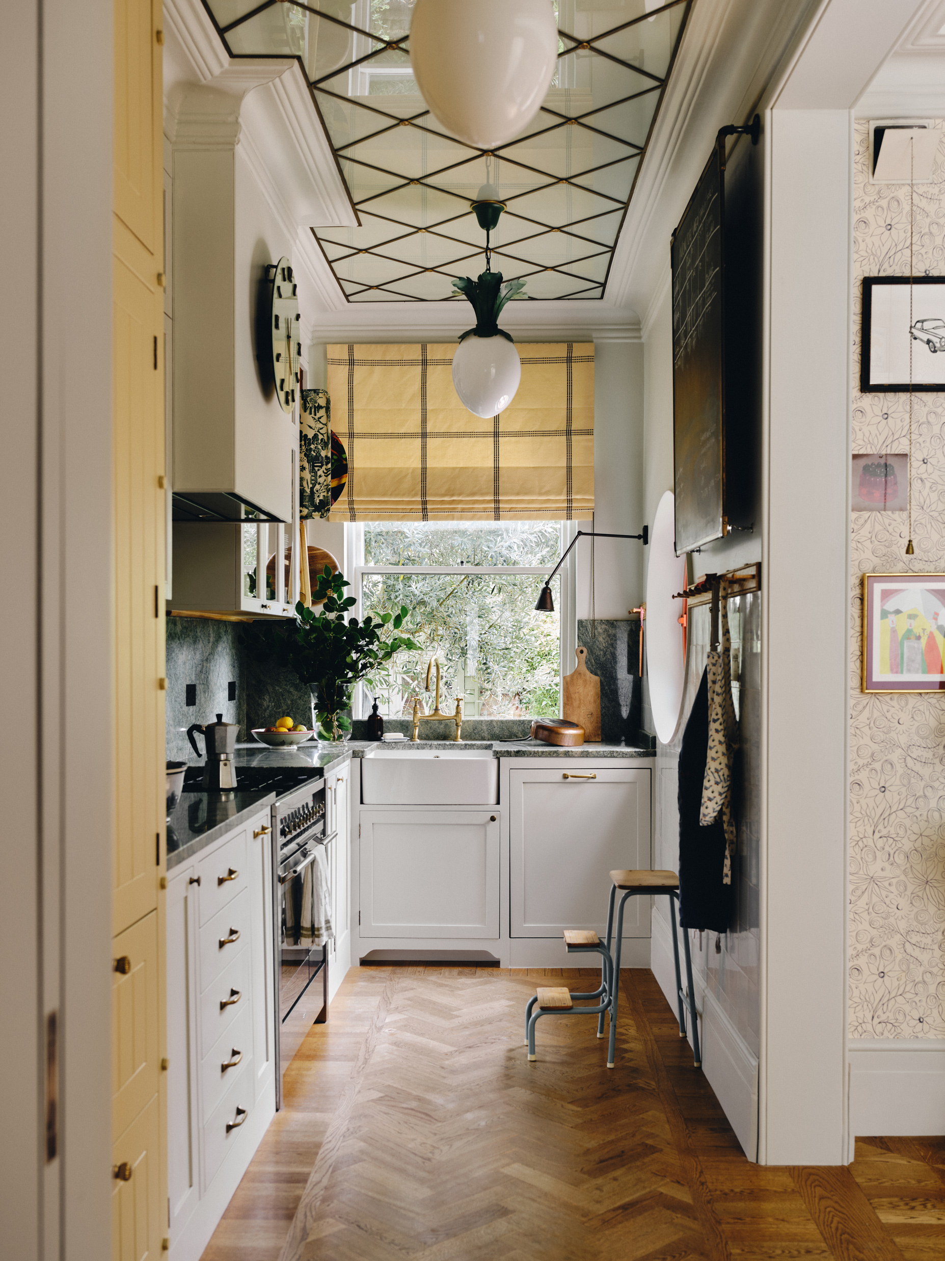

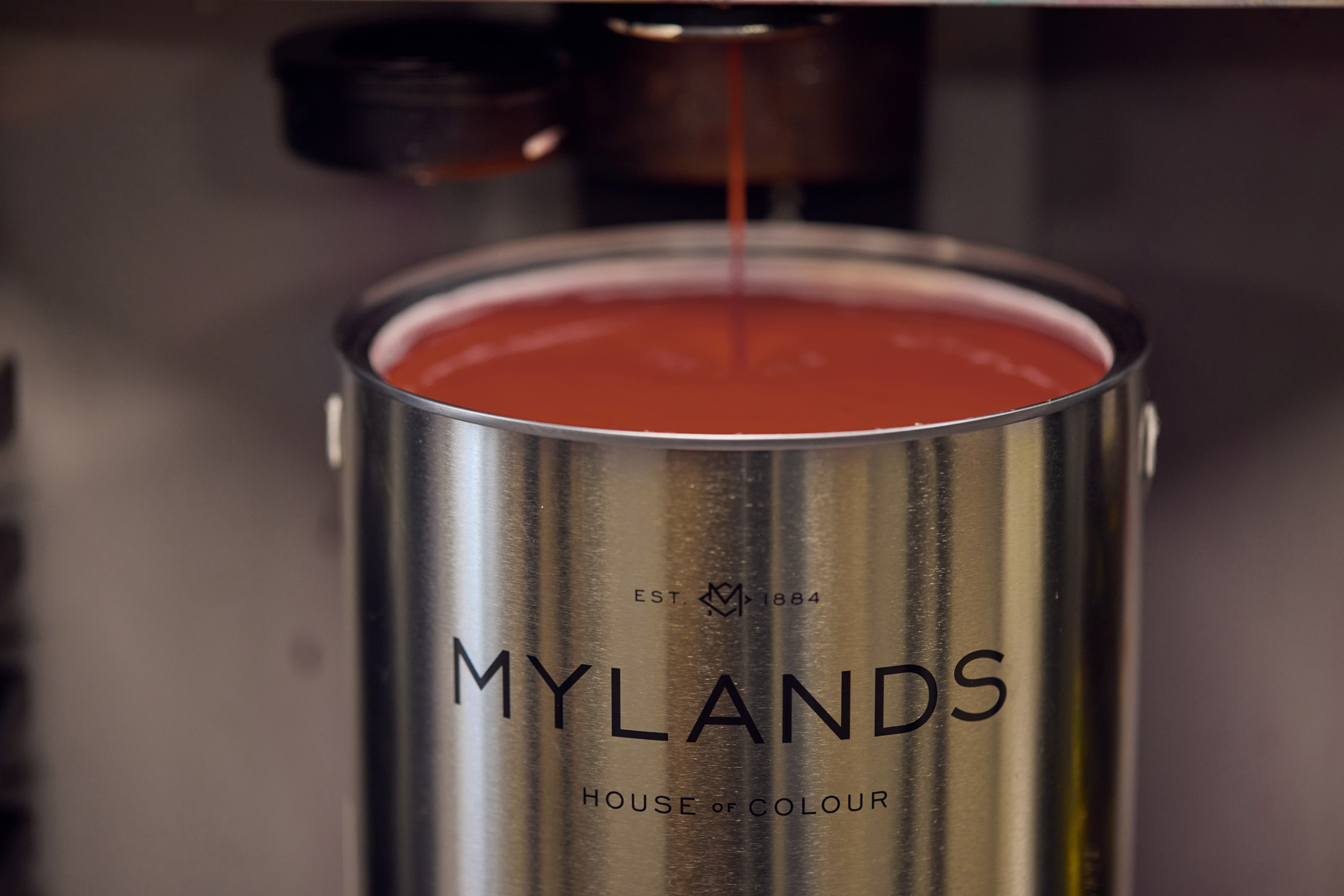
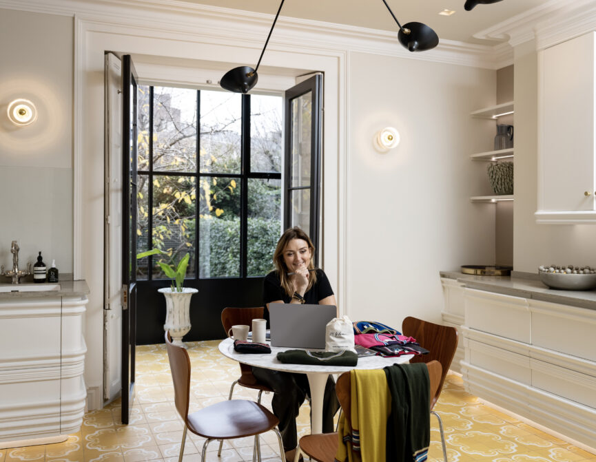
The collaboration – aptly named The Dependables – is a natural fit. Operating in London since 1884, Mylands originally sold to trade clients only; the paint of choice for interior designers, decorators and scenic artists. Officially opening to customers directly in 2012, Beata had already used the brand’s paints extensively in the restoration of her studio at 188 Hammersmith Road, creating bespoke shades that spoke to the character of the space.
“That process was the spark,” she muses. “Mylands’ quality and passion for paint is the driver behind their business. I’ve always wanted to do my own collection, and knew they’d be the perfect partner.”
Her inspiration? The rich, timeworn hues of historic interiors – particularly 19th century homes in Sweden (Beata’s birthplace), where a limited selection of pigments resulted in an unexpectedly vibrant aesthetic. “There’s a warmth and depth to these colours that I love,” she adds. “And they work beautifully in modern spaces too. This was the perfect opportunity to refine a palette that’s been forming in my head for years.”
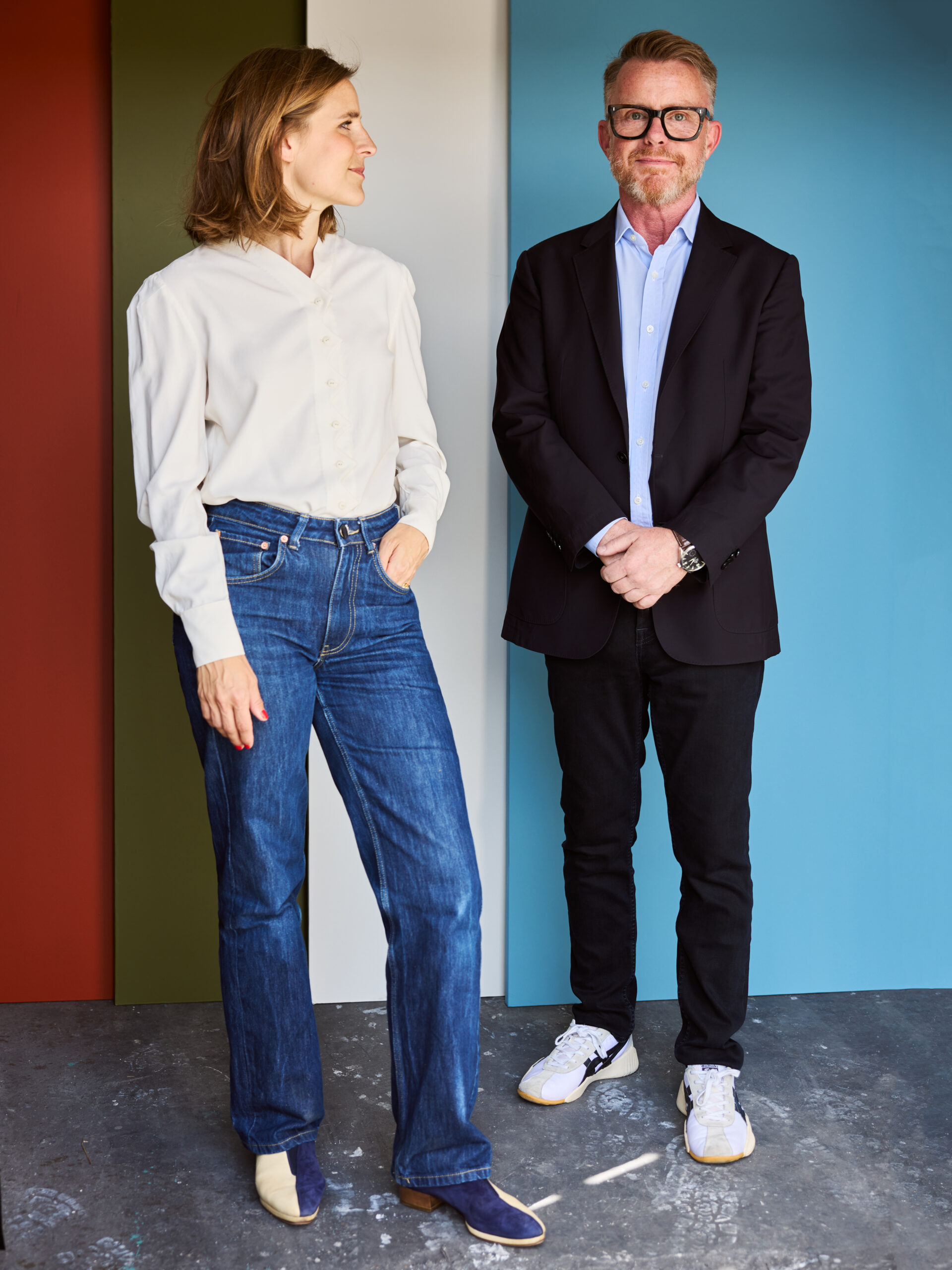
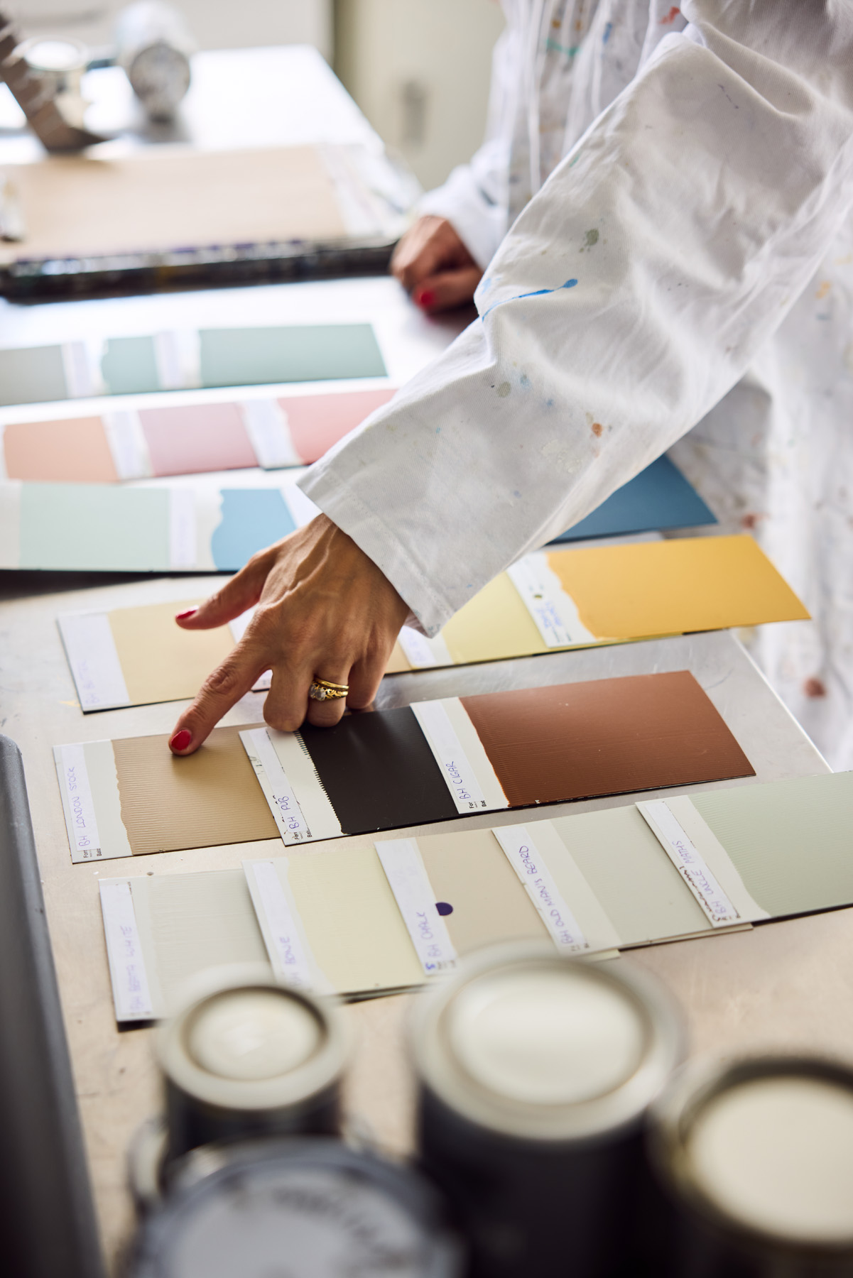

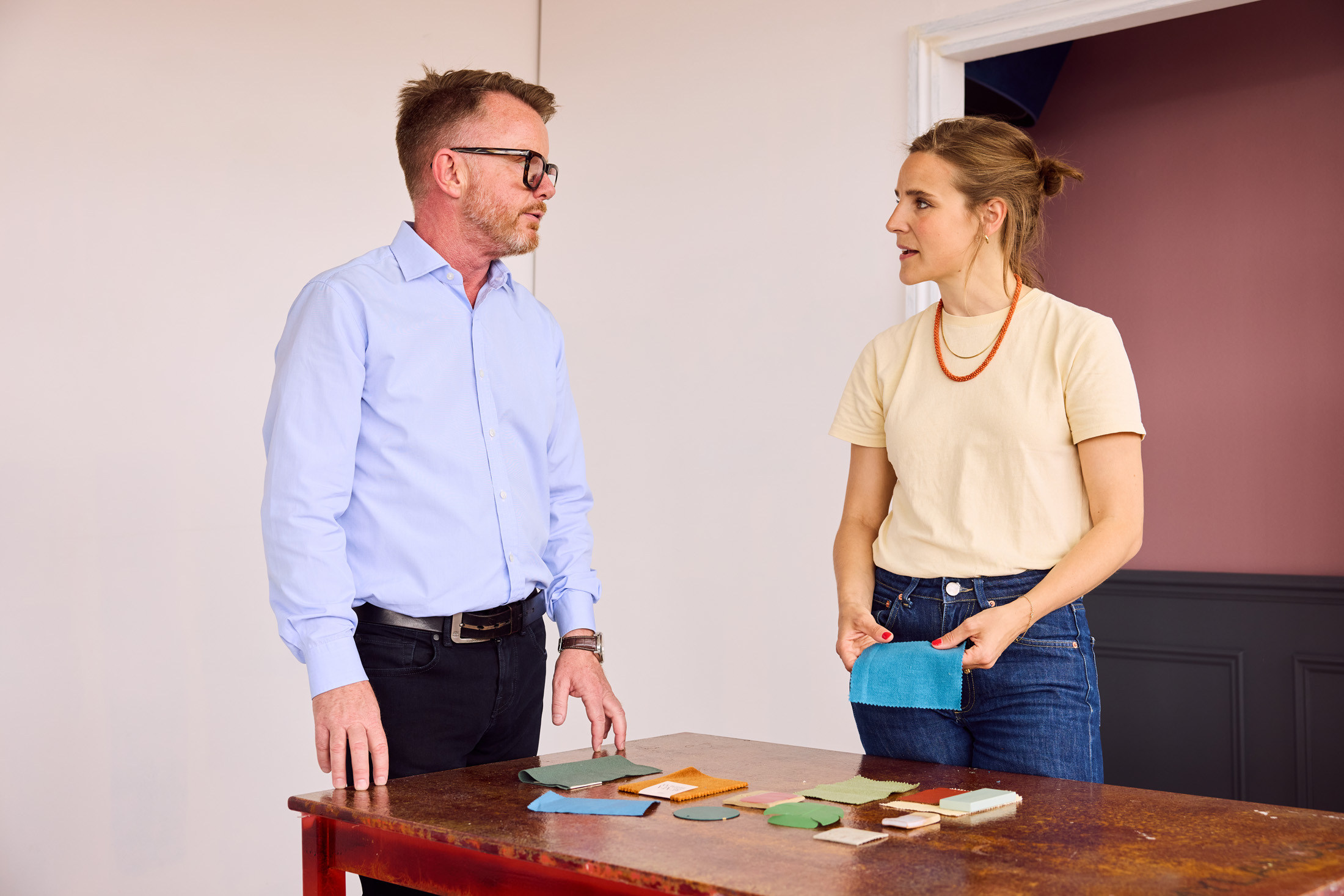
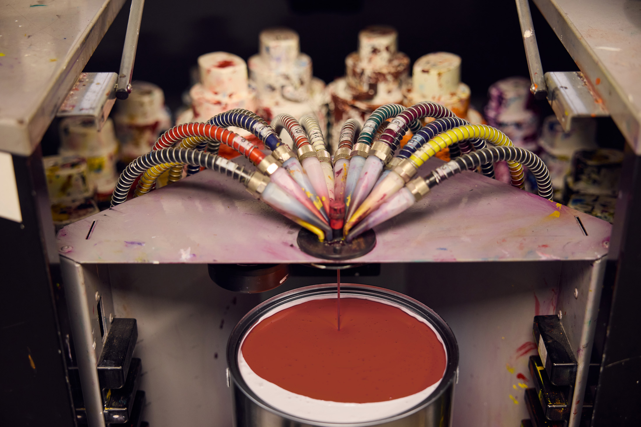
The process of finessing the collection was meticulous, with the Mylands colour scientists – led by CEO Dominic Mylands – transforming each concept into a tangible shade. “The idea was to create a capsule collection that could tick all of the boxes; a broad but concise range that would serve your whole house,” she explains. “They work as a whole, but each has its own character too.”
While some shades emerged fully formed, others took multiple iterations to perfect. “Cigar [a retro toffee chocolate brown and graphic alternative to natural wood] took seven attempts,” she admits. “But Anna, the head of Mylands’ Colour Lab, never gave up. The team are all so enthusiastic and that commitment to getting it exactly right really shines through. It’s part of what makes it so special.”
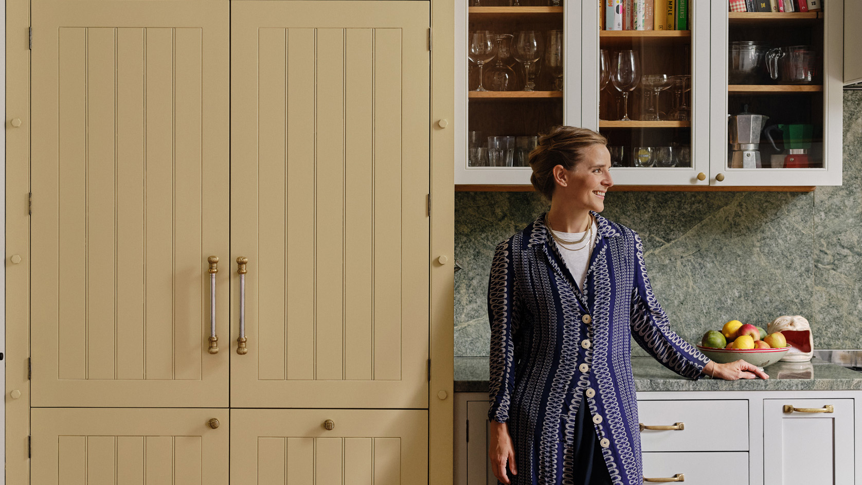
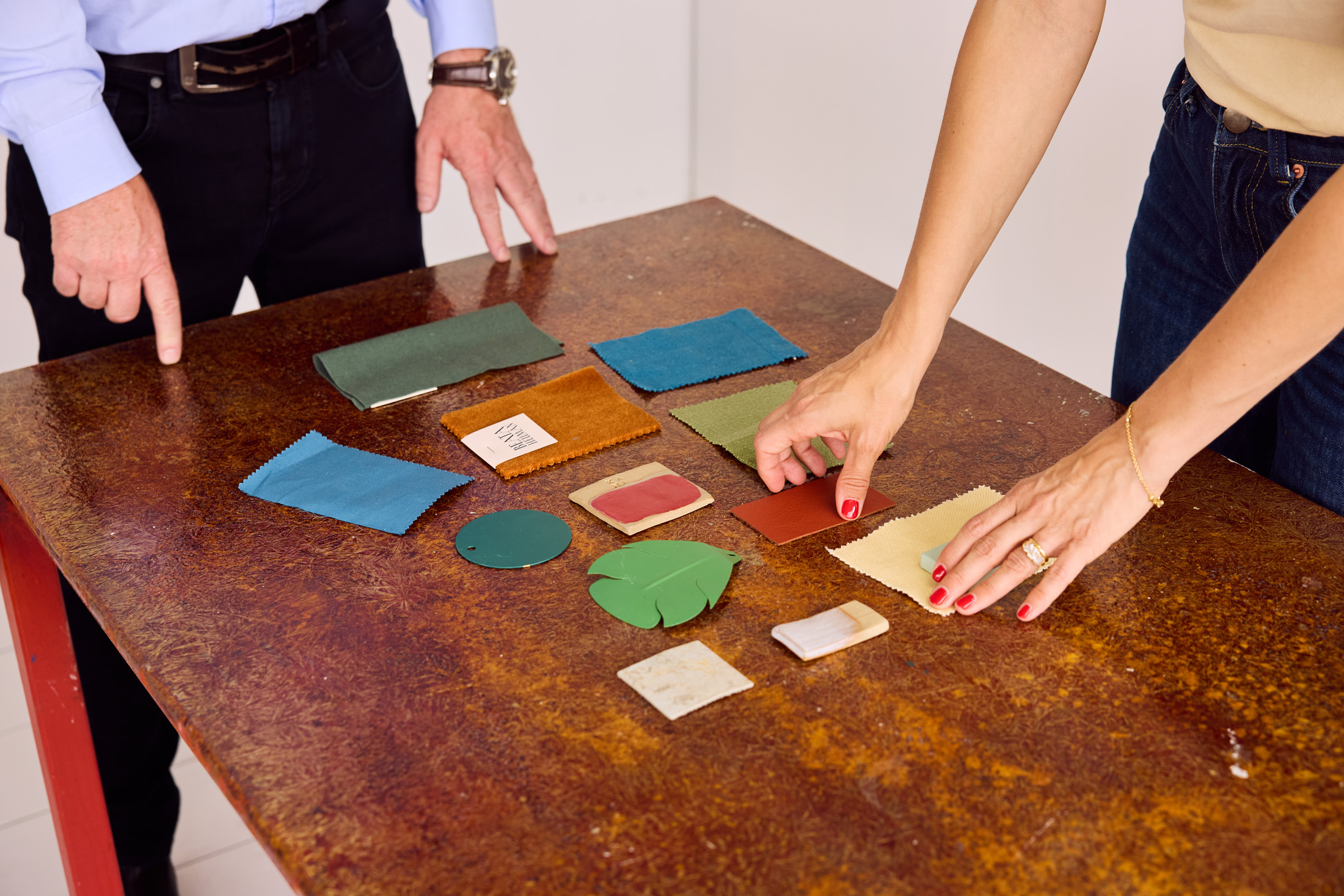
With The Dependables, you have a hand-selected toolbox for interior refreshes. There’s Beata White, a soft, warm neutral the designer returns to time and again; Crayfish Party, a vivid pop of red perfect for accents; and Wheatsheaf, a buttery yellow that brings joinery to life. “A strong colour choice works best when surrounded by something quieter,” Beata advises. “That way, it never overwhelms, it just enhances.”
For homeowners navigating their own palettes, Beata’s approach is refreshingly practical. “Plan the whole house in one go rather than room by room,” she recommends. “If you’re starting out or unsure where to go with it, keep the backdrop relatively neutral. Then you can layer in colour through accents, fabrics and furniture.”
The most successful results, Beata believes, are all about balance. Take the colour palette at Chevening Road. Punctuated with uplifting greens and blues, soft earthy tones connect spaces across the home while keeping them distinct. “I like to have a sense of cohesion, but never too matchy. It’s nice to have contrast and tension in moderation.”
As for her go-to shades, Beata is less decisive. “I think all of the shades in the collection are really special,” she smiles. “It reflects a palette refined over decades of designing interiors. Trusted colours you can rely on for any room.” For the moment, Beata is drawn to soft yellows – faded, buttery tones that offer warmth without overwhelming. “It’s an interesting alternative to white,” she muses. “Something that feels both fresh and timeless.”


