Style over substance? Sophie Nguyen makes a case for both with noble, client-centric design.
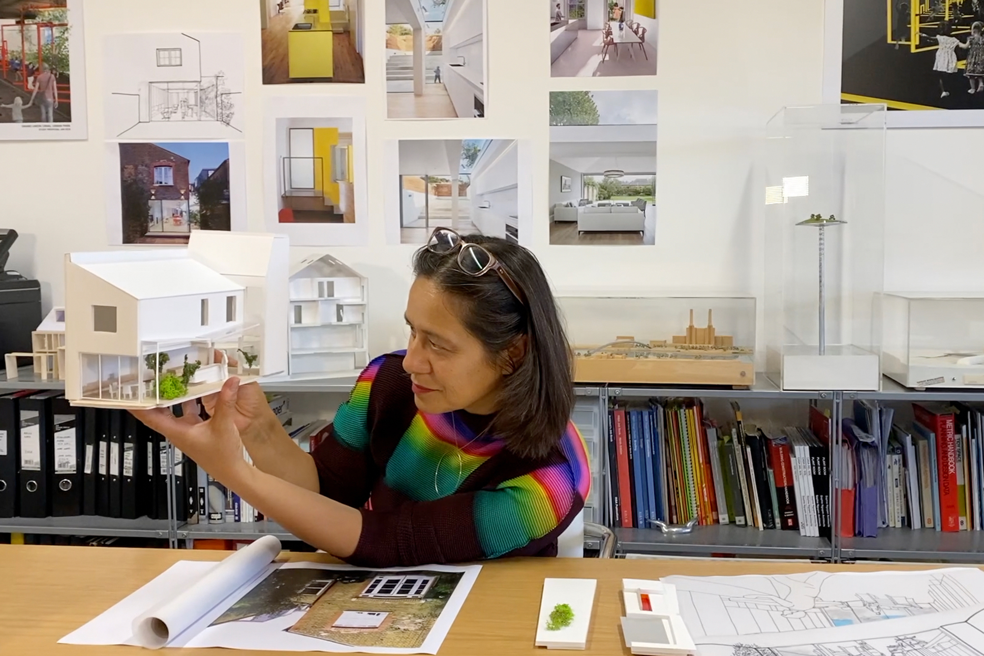
Experienced in projects ranging from Heathrow Terminal 5 to the Musee des Beaux Arts in Lille, there’s little that architect Sophie Nguyen can’t turn a hand to. Recently gravitating towards domestic developments, a client-focused approach has seen London homes redesigned with playful details intended to enhance modern living.
“An architectural project is an opportunity to define how one would like to live,” muses Sophie, whose latest works endeavour to maximise space and clear unnecessary complexities. She reflects, “It comes as a surprise to some clients that when we discuss their project, my first priority is to find out how they wish to live”.
Regardless of the space or style, bringing clarity to designs is the initial priority. “Where will they spend their time in their house? How do they wish to co-exist as a family? A project grows out of these discussions.”
For Sophie Nguyen Architects, approaching projects with a collaborative vision is crucial to creating spaces that reflect the wants and needs of clientele. Before aesthetics, practical factors are considered.
There are opportunities for colour and playfulness in design, and I love to design spaces that surprise people.
– Sophie Nguyen
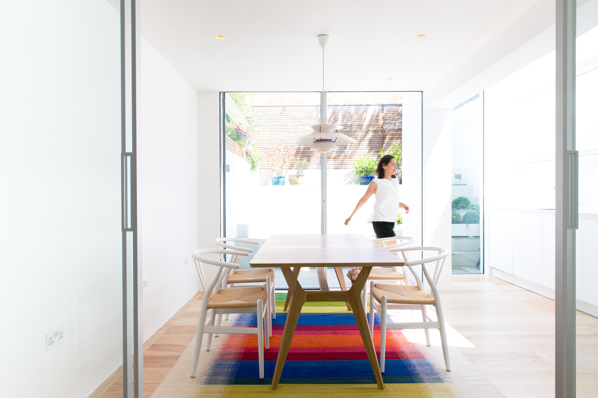
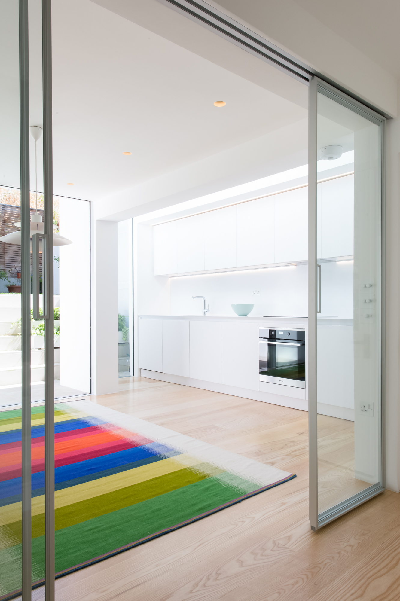
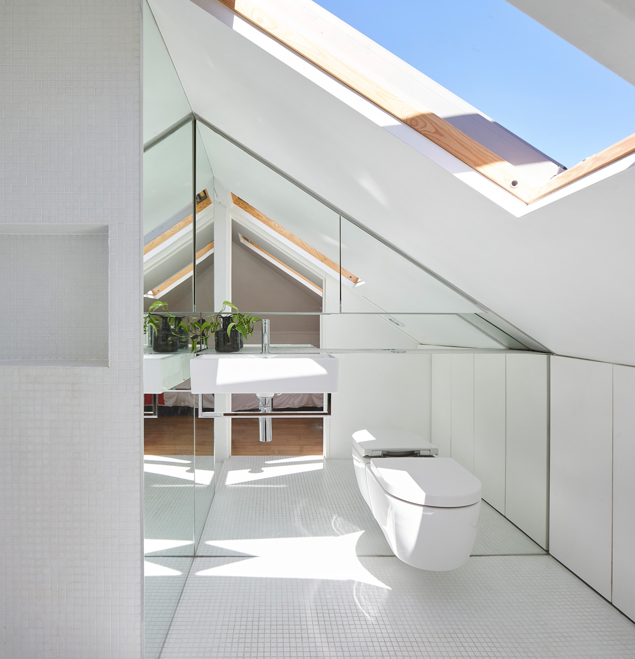
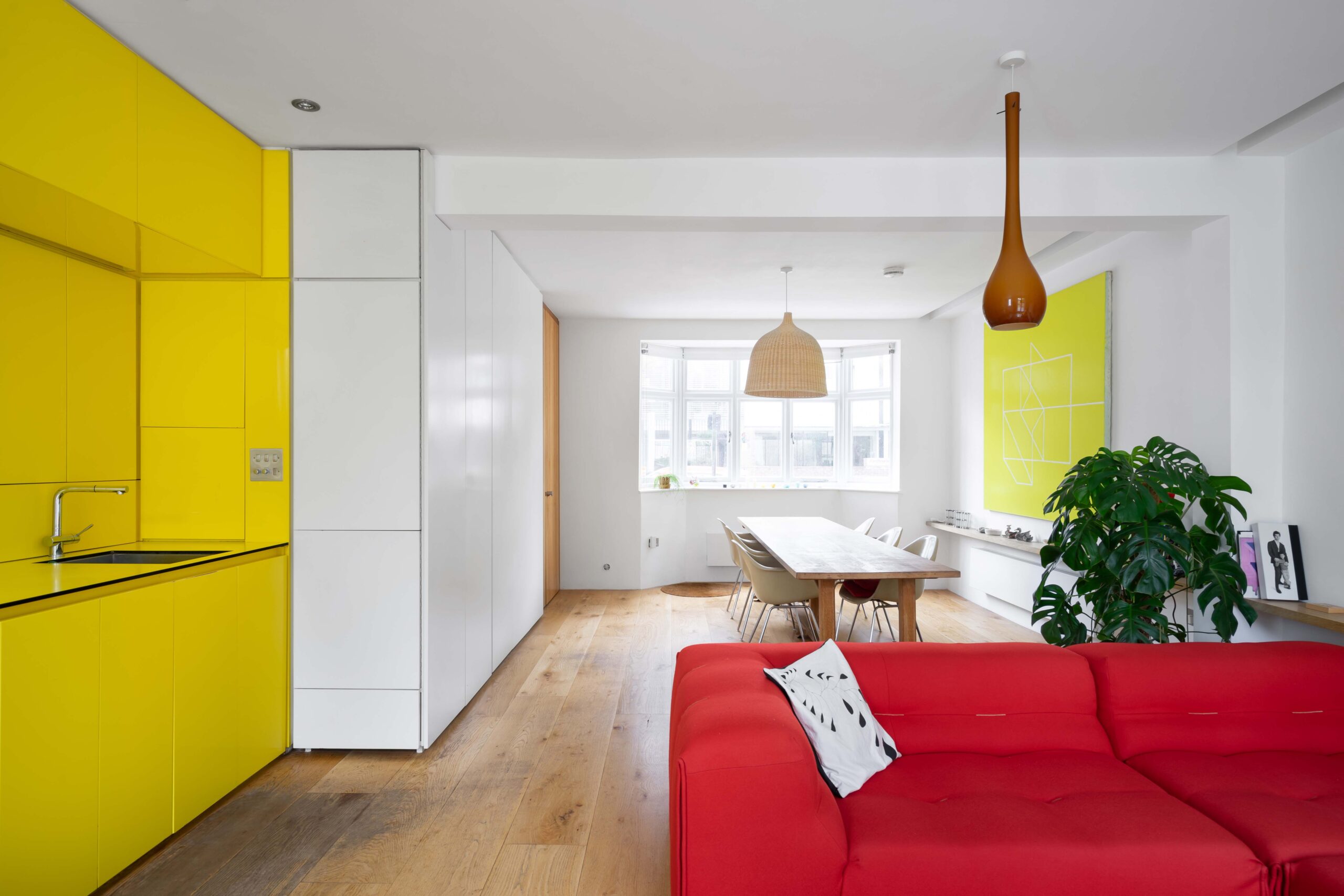
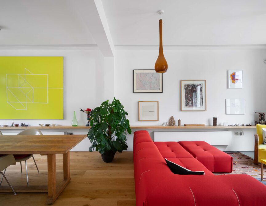
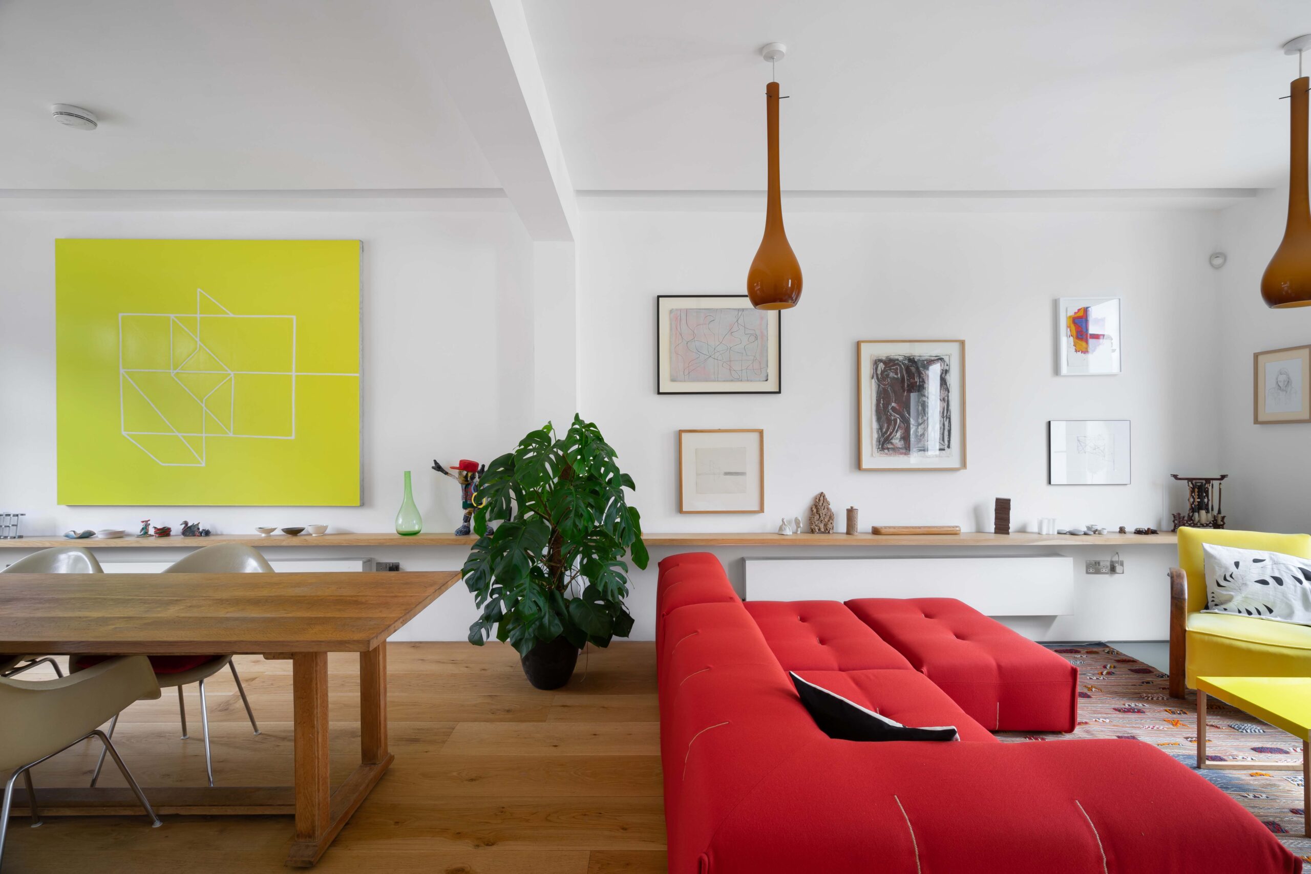
Yet there’s no sacrificing style when bringing tangible plans to the table. “There are opportunities for colour and playfulness and I love to design spaces that surprise people,” Sophie explains. While aiming “to leave only the elements of design that are essential”, recurring stylistic themes are visible from early projects. A glance over Sophie’s portfolio indicates a playfulness in design with bright pops of colour now synonymous with her work.
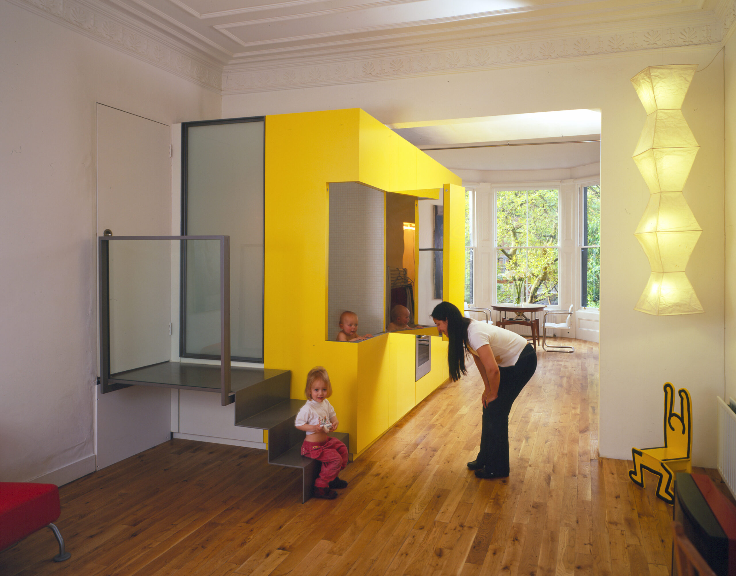
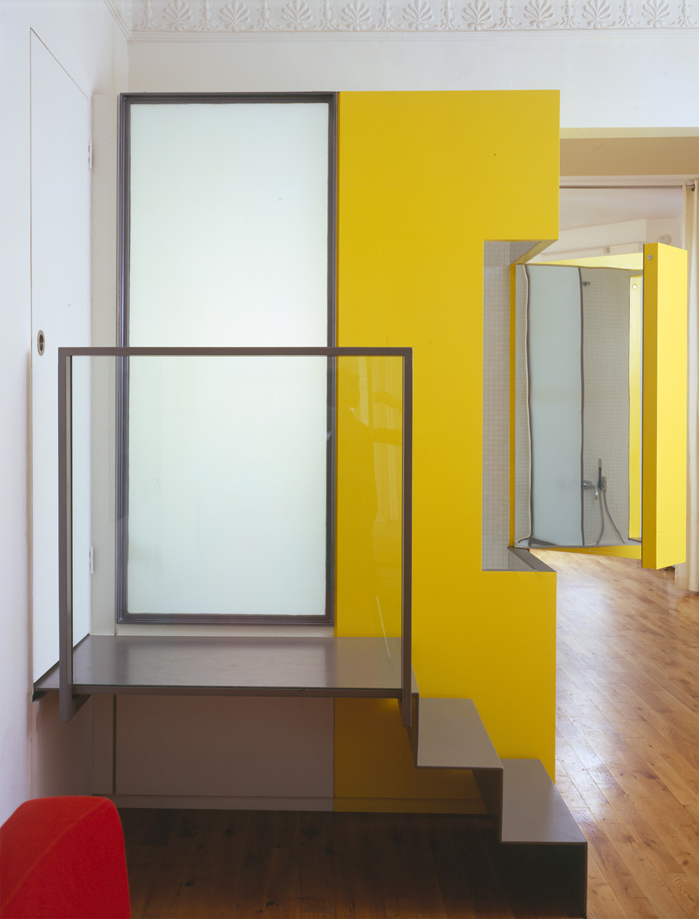
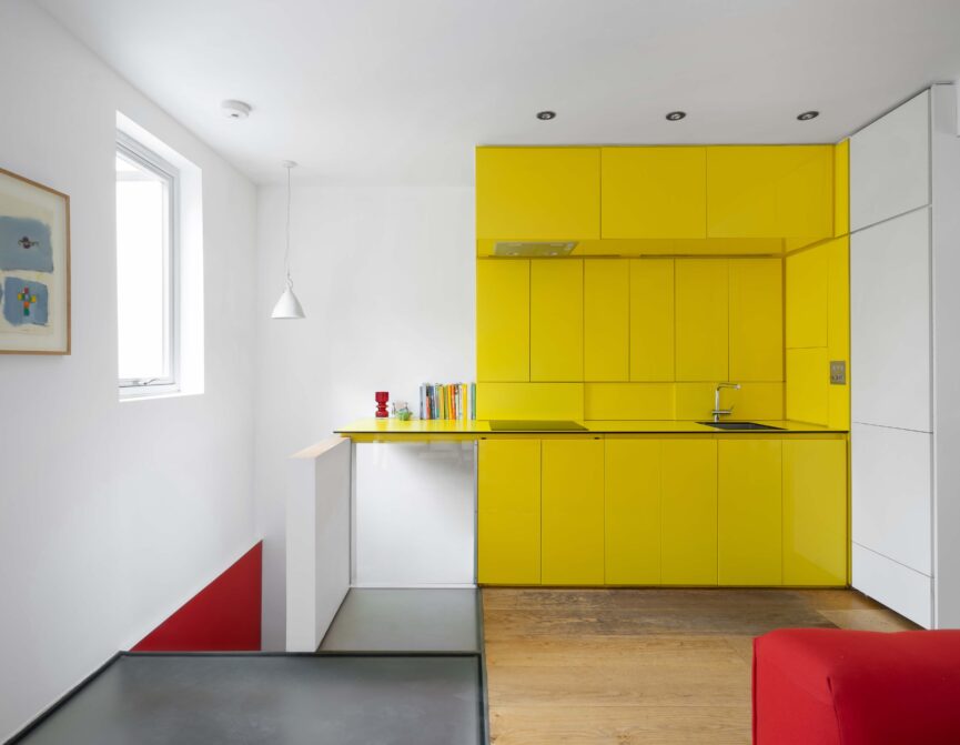
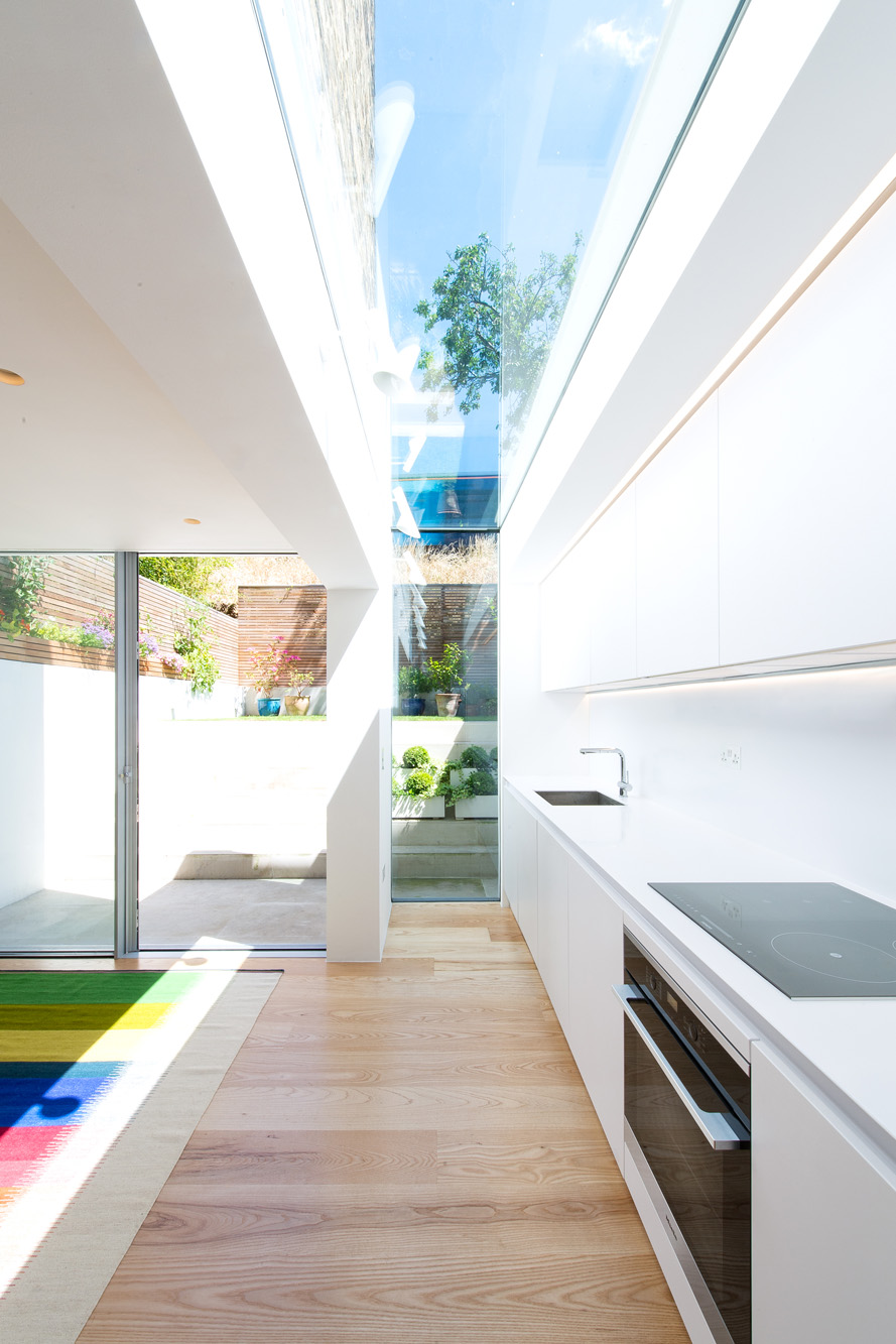
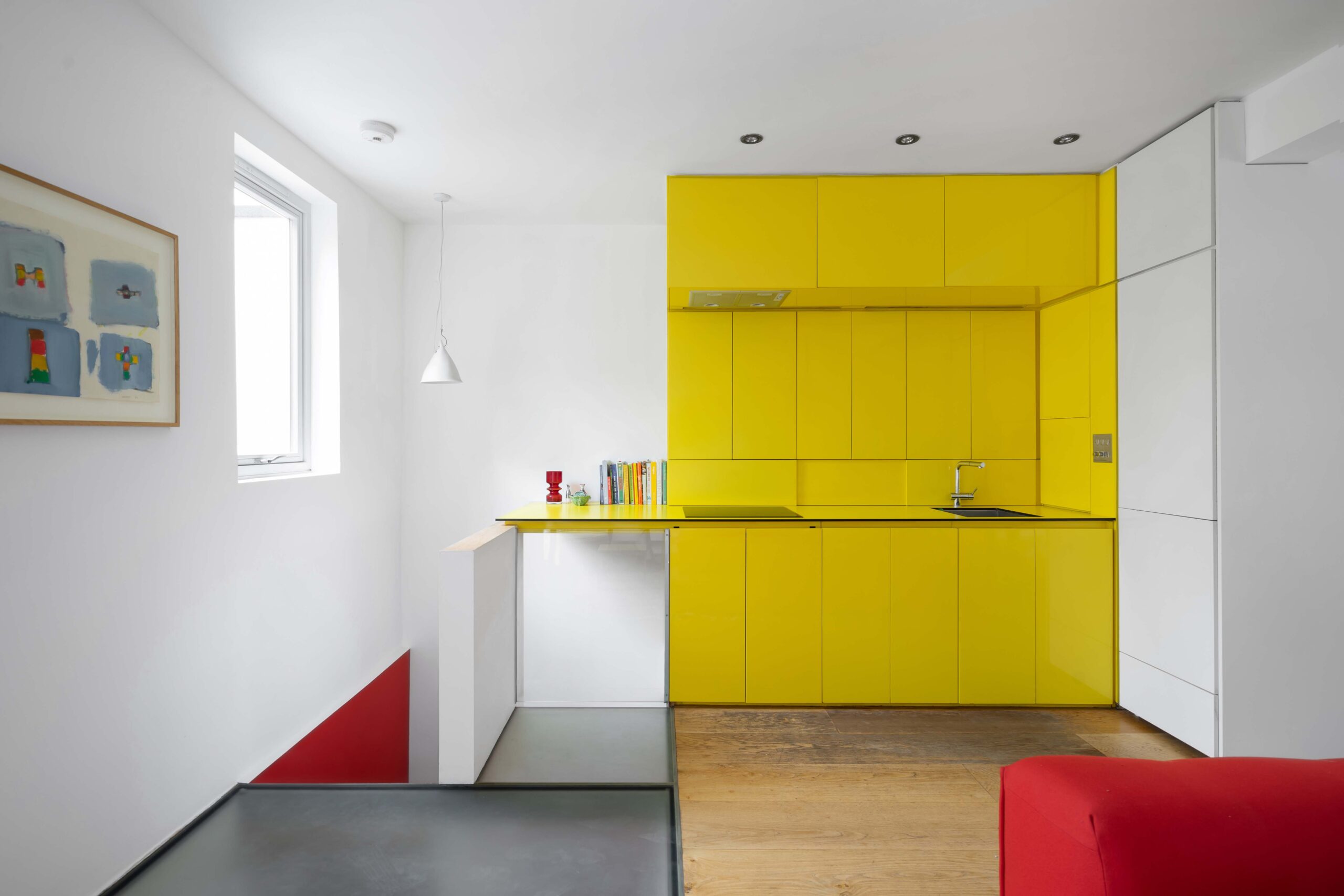
Light-filled, airy spaces are a further recurring feature. Considering volume to be a defining feature in how we experience our homes, Sophie refers to a recent project that reflects this. Dubbed the Yellow Submarine for its bright yellow kitchen unit, a lowered ceiling and maze of cardboard partitions posed a challenge for Sophie’s guiding principles. With a single open space in mind, the ceiling was removed to reveal the original height, and the area was cleared from front to back, bringing in light from either end of the apartment.
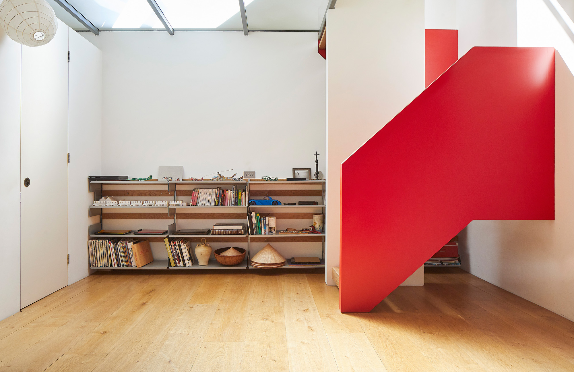
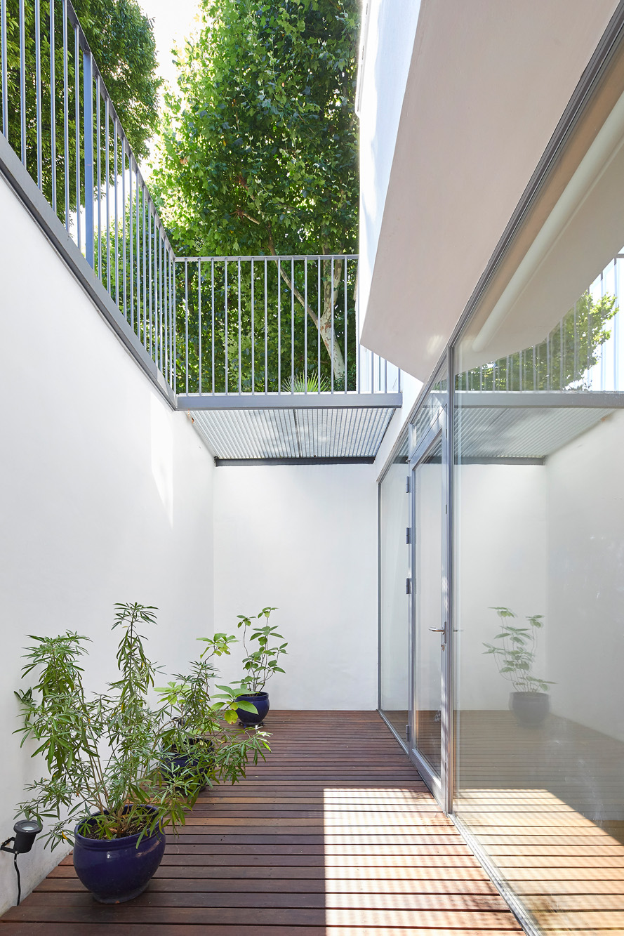
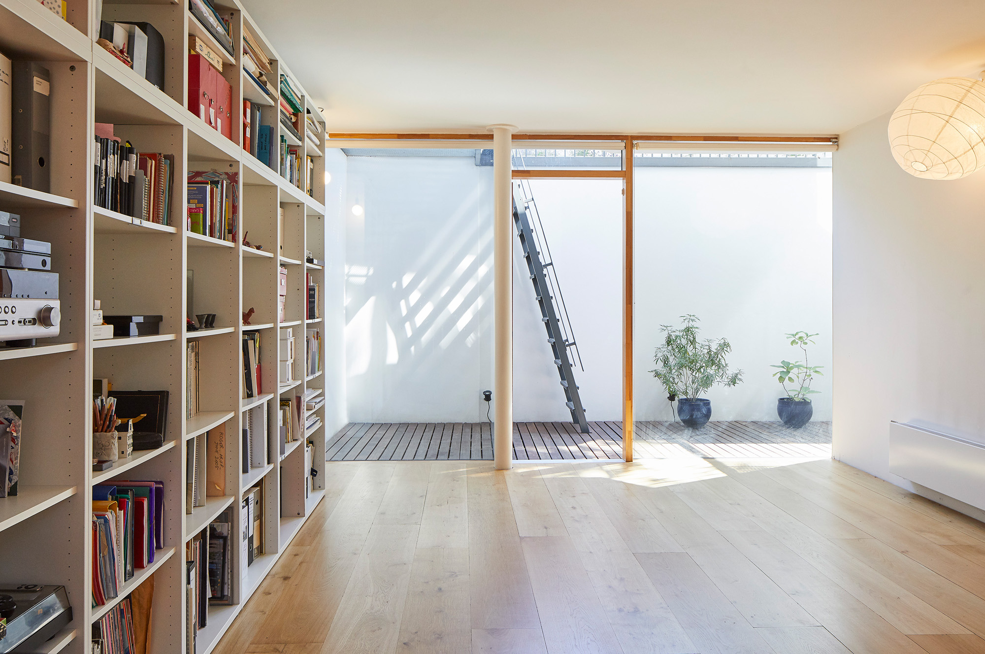
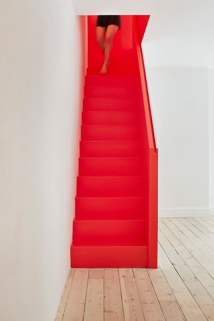
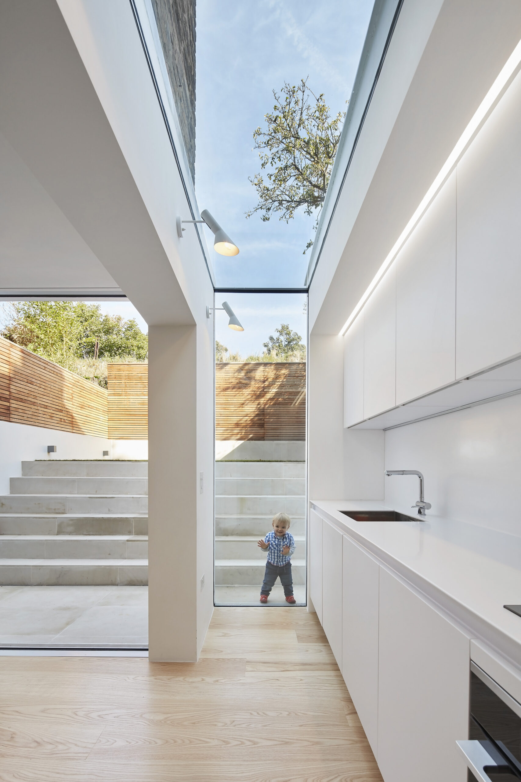
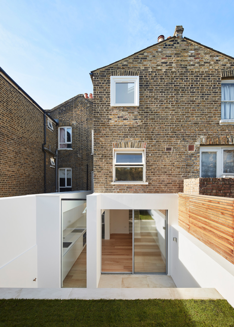
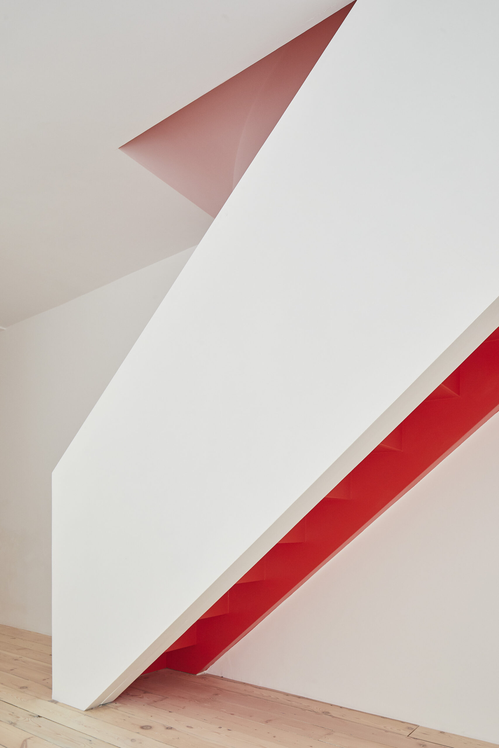
These principles are equally apparent in Hover House on Pangbourne Avenue, where maximizing space was a key priority. With a multifunctional family room as the focus, existing issues around shallow foundations allowed the creation of a basement to solve both structural and space concerns. The result: a versatile reception room flooded with natural light from an added light well. Connecting the ground floor, a staircase akin to a sculptural object. Demonstrably fulfilling the brief, Sophie notes that “it has variously been an office, a living room, a library, a sleepover space, and yes, a gym and a cinema”.

While it’s evident that the client takes centre stage in her designs, on contemplating future projects, Sophie sees sustainability as the true driving force. “As we account for the environment increasingly precisely, we will design for removal and reuse, using recycled materials wherever we can – and will create spaces that have enough inherent flexibility that they will last for as long as possible without the need to strip out and start again.”
Having strived for the most efficient use of spaces and minimal materials, Sophie maintains optimistic about her ability to meet this challenge. “I consider that this approach will only be beneficial for design, be it individual buildings, or the entire city.”


