Grey matter: A concrete villa in tune with its surroundings
Brutalism, breathtaking views out to Es Vedrá and Balinese-inspired design combine at Can Cubista, a new-build villa that mesmerises with its bold materiality.

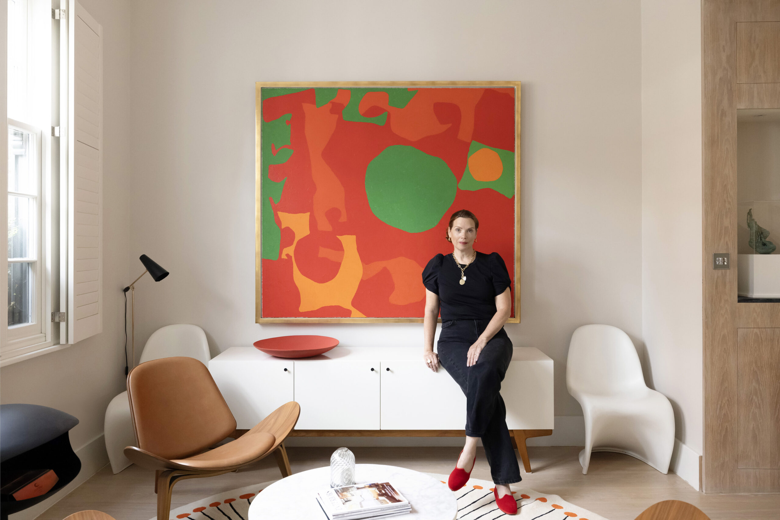
On the doorstep to the ‘lungs of London’, and with an unrivalled view of the capital’s skyline, Christiana Marran fell for the best-of-both worlds feel of her Hampstead home. Hampstead is probably as close to a chocolate box-esque village as you’ll get in London. With sprawling heathland on the doorstep, independent businesses scattered along its […]
The inside track on design, culture and lifestyle in London and Ibiza. Architects, interior designers and homeowners share their inspiration – and the ideas shaping how we live.
Brutalism, breathtaking views out to Es Vedrá and Balinese-inspired design combine at Can Cubista, a new-build villa that mesmerises with its bold materiality.
Architect Adie Perkins and interior designer Ananth Ramaswamy on creating the healthiest and most thermally efficient of living environments at Esmond Road.
Defying expectations, the interior designer has turned quintessential Balearic style on its head at this 500-year-old finca with unexpected materials and antique furniture.
Leading interior designers and owners with a sharp eye have lent their vision to island retreats that are anything but ordinary.
Founders David Tigg and Rachel Coll show us around the architectural practice’s new Brook Green home – a daring, democratic space that embodies their guiding design principles.
There’s no shortage of beachfront dining spots on the island. Explore our roundup of must-try restaurants that have made their success on the sand.
Stuart Bennett has been honing his craft for almost three decades. Here, he reflects on entering a new era in his life in property.
Fulham Broadway meets the Balearics at this calming three-floor home, completely transformed by developer owner David Roberts.