The designers behind these standout transformations reveal how vast footprints can still feel instinctively liveable.
Space is often something we try to control – divide, soften, make manageable. Here, it’s the starting point. Former studios, garages and reworked townhouses, these interiors deal in volume – wide spans, double heights, long sightlines. The question is not how to fill them, but how to live in them.
The answer lies in restraint. Walls are pared back, circulation simplified and materials kept deliberately concise. What emerges is a different kind of domesticity – settings that feel open but with privacy built in. Each home arrives at that balance in its own way – through light, structure or atmosphere – but the principle remains the same: to work with space, not against it.
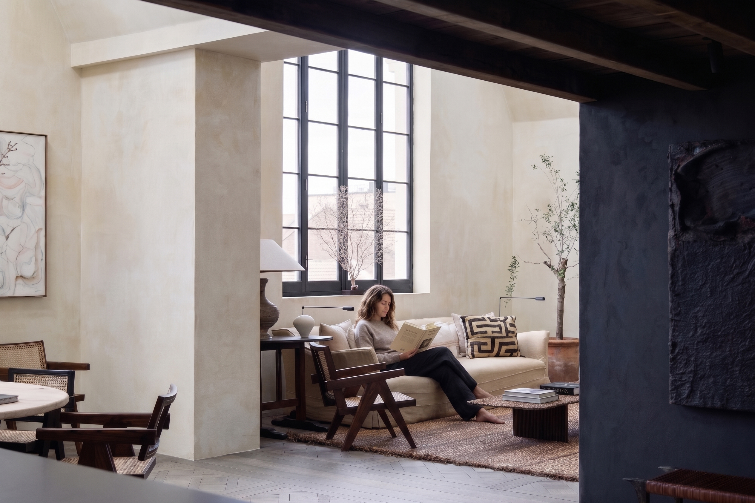
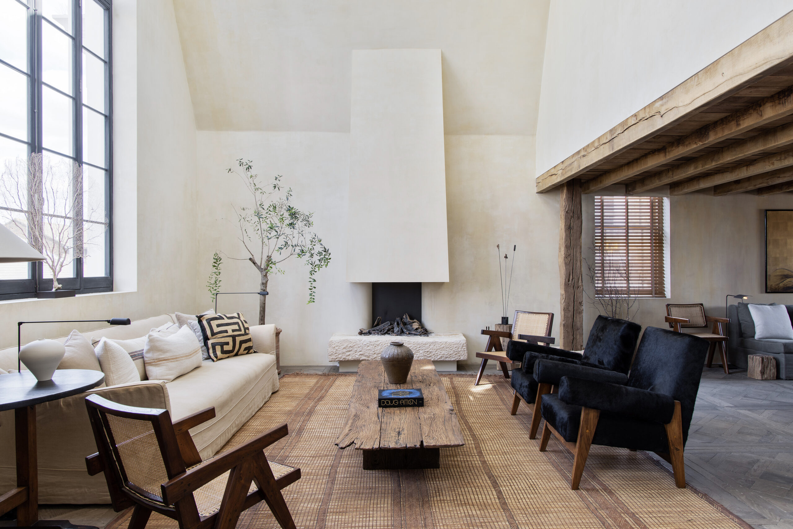
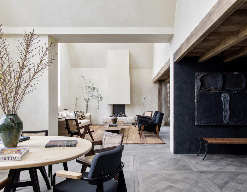
At Blenheim Crescent, a former painter’s studio in Notting Hill, it wasn’t the architecture but the light that set the direction. Pouring through vast, double-height windows and catching on old beams, it hinted at the building’s former life – even after years of unsympathetic alterations.
“We were so drawn to those windows,” recalls interior designer Saskia Blyth of Blyth Collinson Interiors. “Everything else just fell away.”
The approach was not simply to renovate, but to restore. Floors were lifted, walls stripped, and the volume allowed to breathe again. A snug and powder room were carved into the lower level, while upstairs, bedrooms became softly cocooned en suite retreats.
In peeling back the layers, the sense of scale is anchored through atmosphere. Limewashed plaster tempers the height, reclaimed parquet de Versailles sourced from Belgium lends weight underfoot, and rustic beams counter the drama of the vaulted ceiling.
“You have to get the canvas right, then you can introduce the details,” Saskia says. “I never want a home to feel like a showroom. It should feel like it’s been lived in – or better yet, like it’s always been this way.”
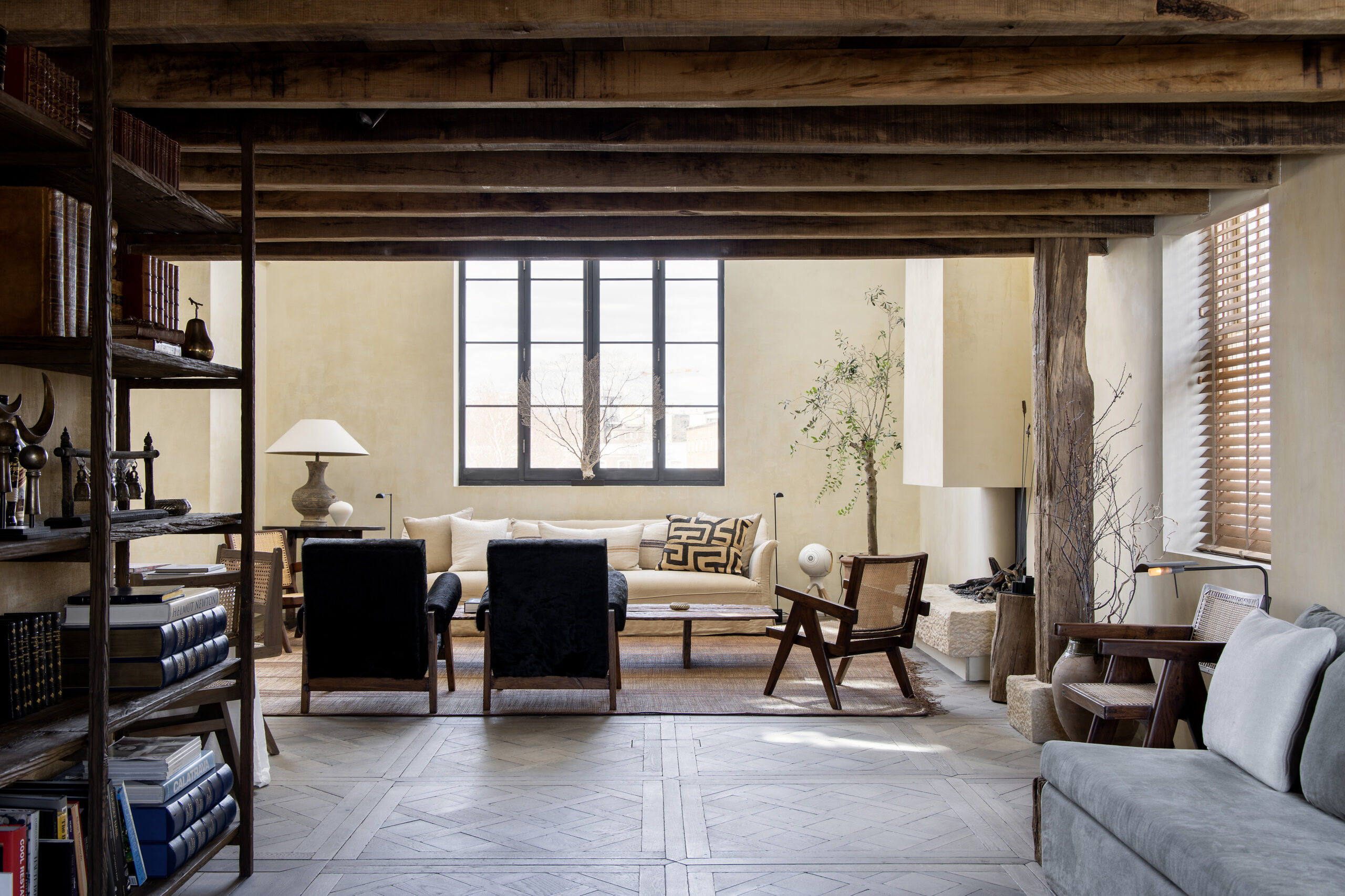
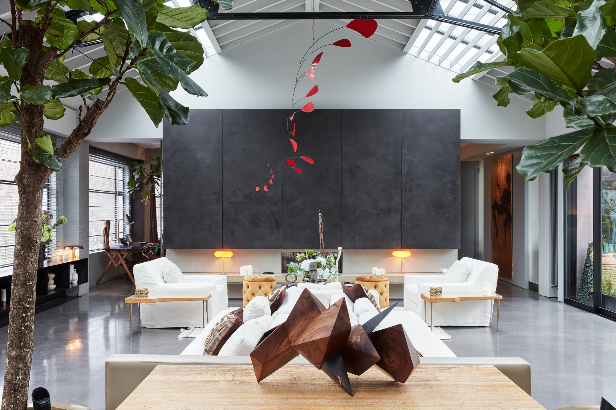
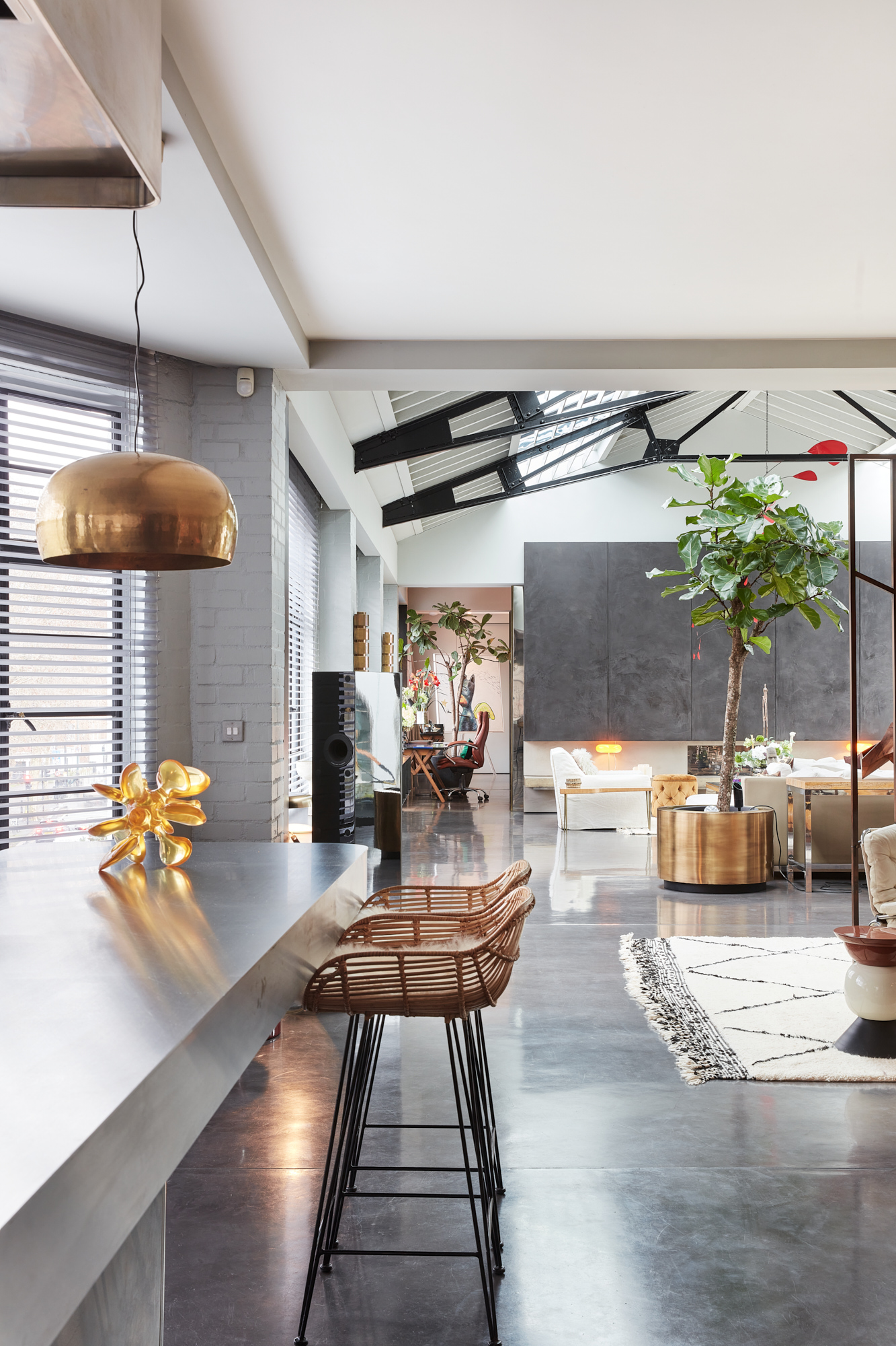
If Blenheim Crescent is shaped through light, at the Talisman Building in Fulham, the question becomes one of organisation. Originally a 1930s garage, it has been remodelled by Gumuchdjian Architects into a series of lateral apartments, including a remarkable 500-square-metre loft. Its scale is immediate – a single floor of extraordinary breadth – but what defines it is how that space is choreographed.
Industrial buildings tend to come with expectations: space, certainly; Crittall glass, almost inevitably. But the real challenge is how to structure them, says architect Philip Gumuchdjian. Here, the apartment delivers on that brief: room to gather and to retreat, abundant natural light, and just the right balance of openness and privacy.
At the centre sits a vast communal core, something Philip likens to a piazza. From this shared space, more intimate rooms unfold – bedrooms, a study, a cinema – distinct yet connected.
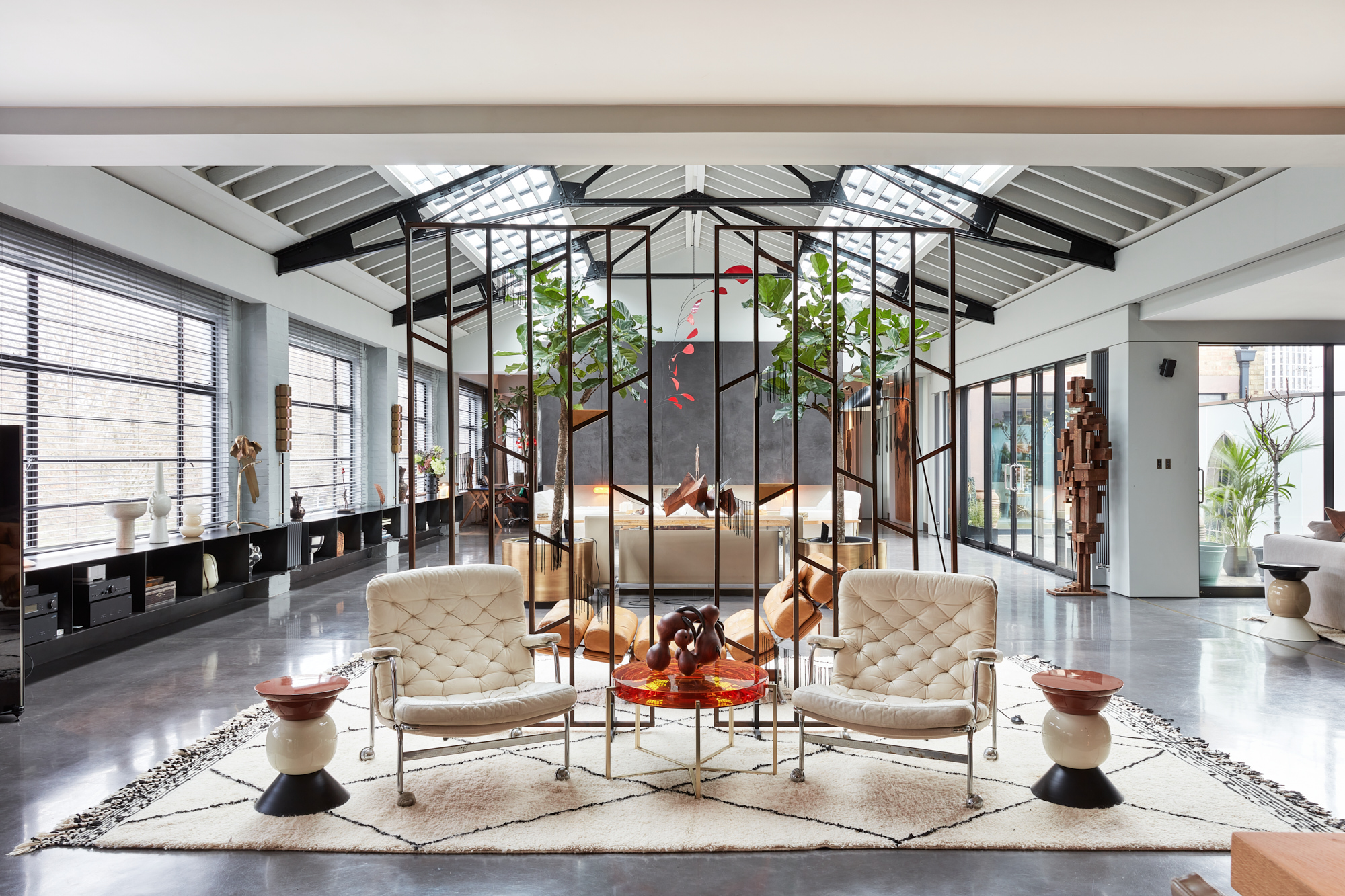
“It’s a very flowing footprint,” he explains. “You’ve got your private areas, but also somewhere to gather, to interact – it’s all connected.”
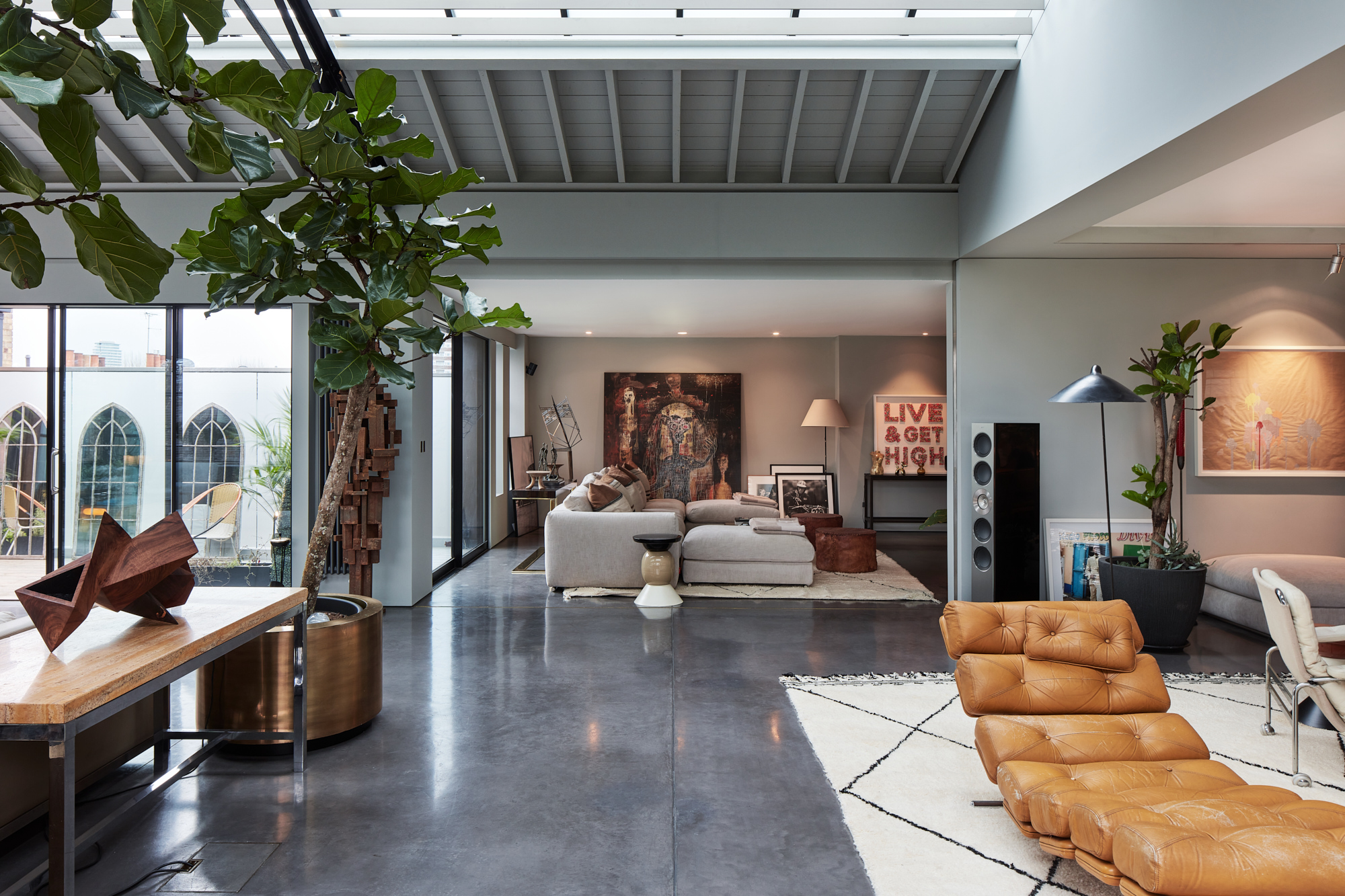
Rather than dividing conventionally, movement is structured through sequence. Sliding doors allow spaces to expand or contract, creating what Philip describes as an enfilade: a series of aligned rooms experienced in one continuous sweep.
The entire footprint is engaged. “A lot of large homes end up with rooms that are just closed off,” he says. “Here, you’re always moving through the main space. You experience the whole space.”
Materially, the palette is robust yet restrained – poured concrete, stainless steel, original Crittall windows – allowing the architecture to assert itself. Above, a vaulted steel and timber ceiling soars, while skylights draw daylight deep inside.
For all its sheer size, the apartment never overwhelms. Instead, it operates with a kind of internal logic: open when it needs to be, enclosed when it matters – designed not just to impress, but to adapt.
At Bristol Gardens, that sense of logic gives way to something more sensory. For Eva Siskinova, co-founder of Dandi and the architect behind the Little Venice house, the experience of space is less about its size than how it feels to move through it.
Some homes rely on colour for impact. Here, contrast does the work. A monochrome palette – bold black set against expansive white – brings clarity, while softening elements ensure it never feels stark.
Light is treated as a material. Skylights puncture the ceiling above the dining area, drawing in warm afternoon sun that moves gently across oak floors and textured surfaces. Crittall-style glazing – a recurring motif – extends sightlines through the house, dissolving boundaries while maintaining definition.
“There’s this feeling of serenity throughout,” Eva says. “The light softens the edges and traces the form of the space.”
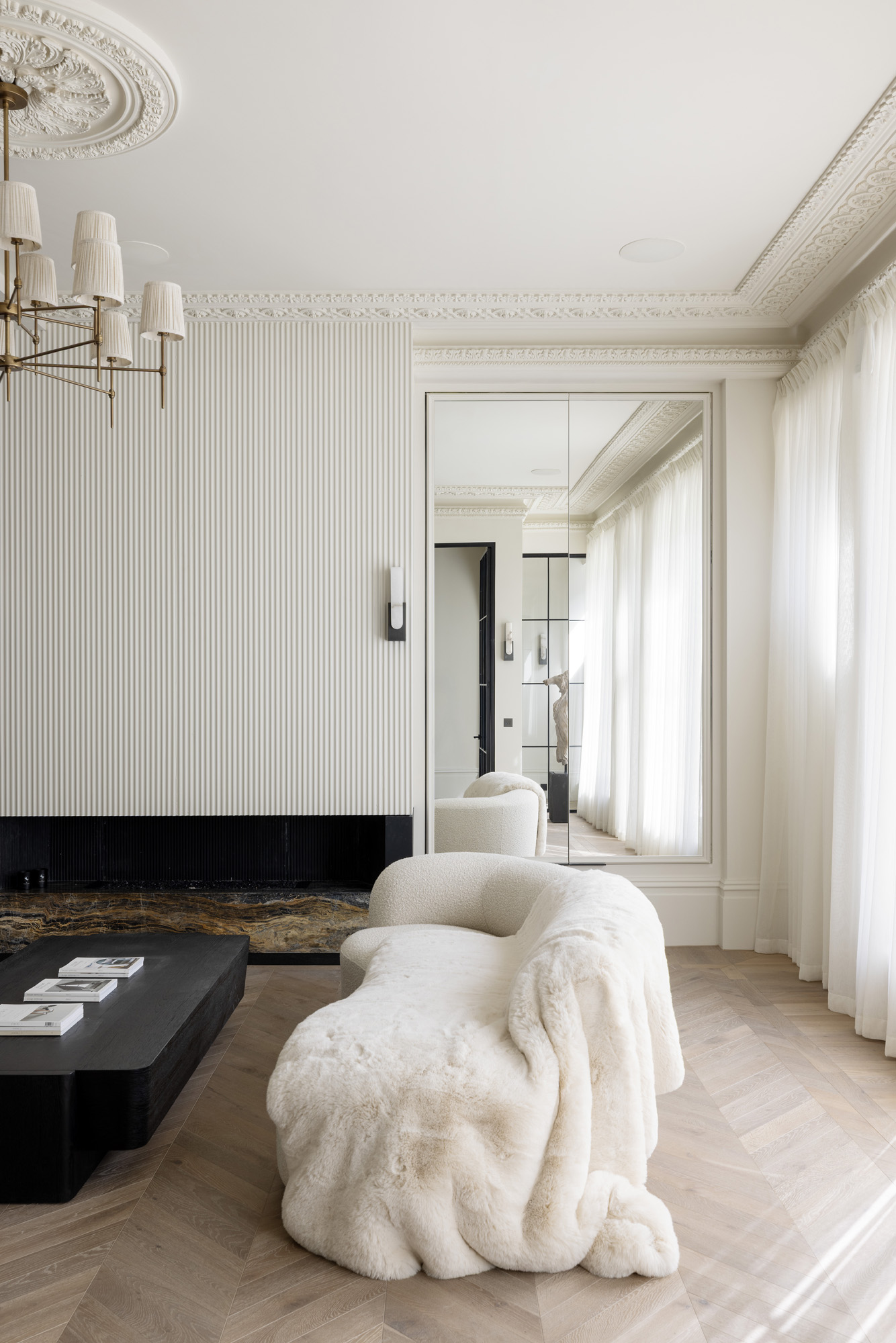
That interplay – between sharpness and softness, openness and closure – runs through the entire house. Archways temper the linearity of glass and steel. Decorative coving and chevron-laid oak introduce classic moments within the otherwise contemporary theme.
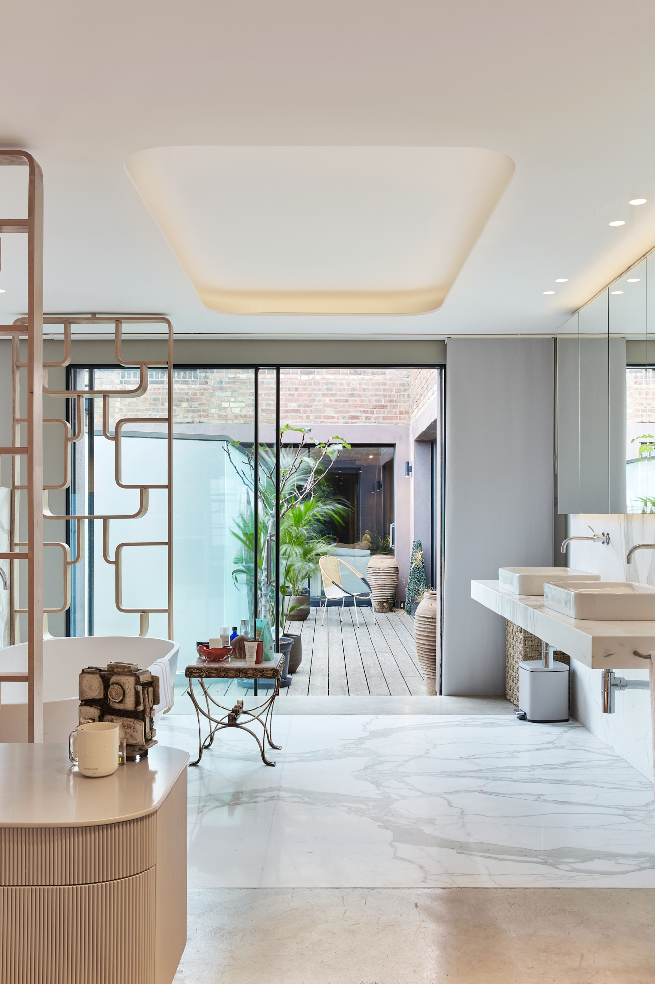
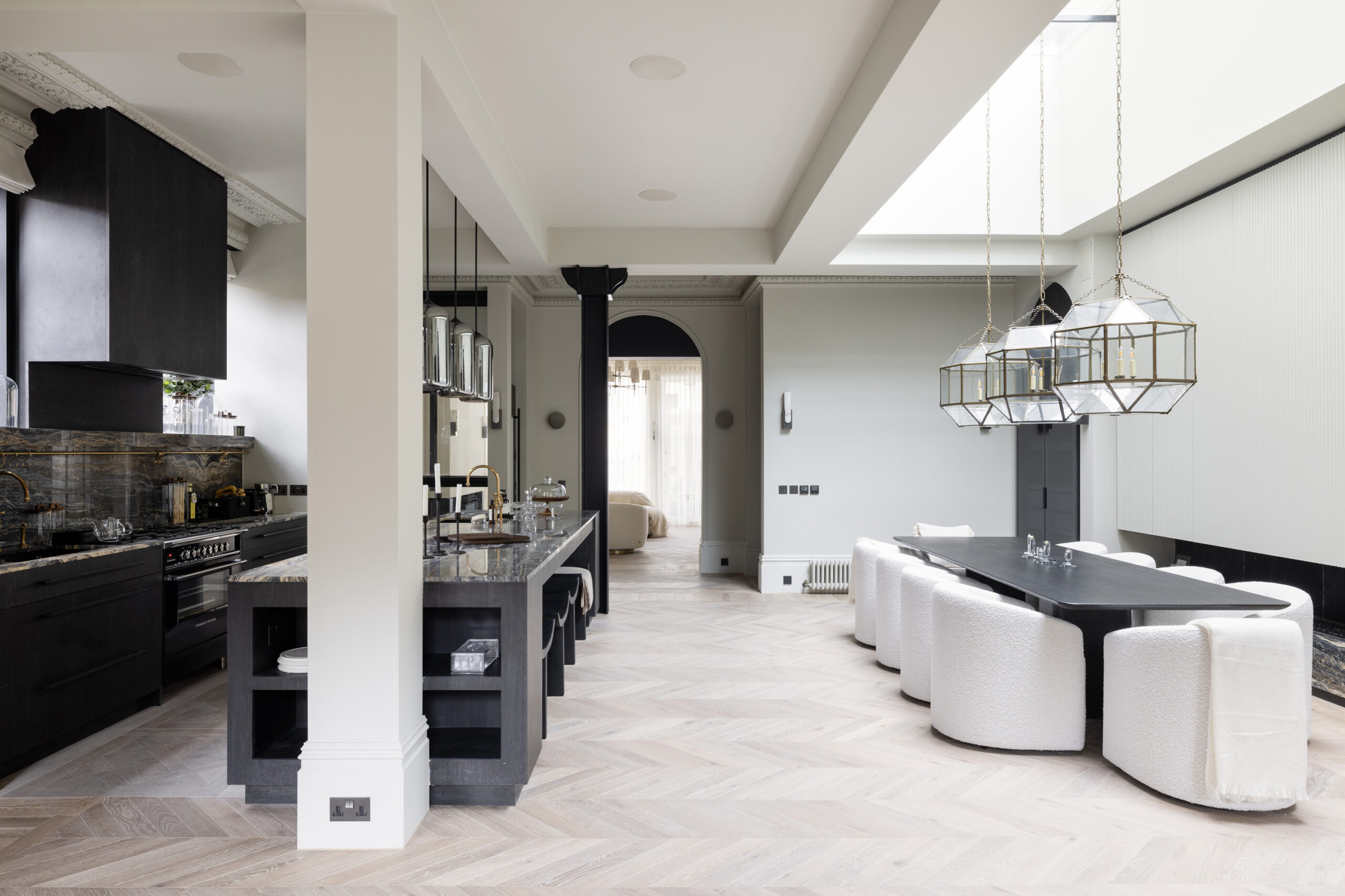
Spanning five floors, Bristol Gardens is undeniably expansive: eight bedrooms, a cinema room, a fully equipped gym with sauna and ice bath, and a rooftop terrace overlooking London. Yet it never feels excessive. Each space is purposeful, connected by a consistent language of material and proportion.
Because scale, on its own, is only the starting point. Across these homes, volume is shaped rather than filled – edited through structure, light and material until it feels legible and lived-in. Nothing overwhelms, even when the footprint suggests otherwise.
The result is a subtle shift in how space is understood: not something to divide, but something to work with – and, ultimately, to live well within.
Blenheim Crescent, the Talisman Penthouse and Bristol Gardens are all available for rent.

Artículos relacionados
Saskia Blyth on rewriting history at Blenheim Crescent
The interior designer replaced the new with the old at this converted artist’s studio in Notting Hill.
The best lettings homes of 2025
Thoughtfully designed, beautifully lived in: the homes we let that stood out this year.