The meaning behind Pantone’s 2021 colour of the year and how to add Ultimate Gray and Illuminating Yellow to your home.
Painting the bedroom. Revamping tired furniture. Fashioning a home office. Given the extra time we’re spending at home lately, it’s unsurprising that we’re rethinking our living spaces. According to a study by Santander, four in five of us plan to make home improvements in 2021. But when we wield paintbrushes, get around to neglected DIY projects or toy with the idea of extensions, conversions or even preparing for selling up: what inspires the palette we choose? And what does that say about us?
For the answer, we turn to the Pantone Color Institute, a team of “colour experts” that has picked apart current events, buzzy topics and psychological studies to tell us that Ultimate Gray and Illuminating – a vivacious yellow – are the shades that will define 2021.
“Practical and rock-solid but at the same time warming and optimistic, this is a colour combination that gives us resilience and hope,” says Leatrice Eiseman, Executive Director of the Pantone Color Institute. “We need to feel encouraged and uplifted, this is essential to the human spirit.”
Grey and yellow are famously paired in Piet Blom’s Cube Houses in Rotterdam, as well as the nearby Luchtsingel pedestrian bridge; in Maurizio Cattelan’s banana duct-taped to a wall at Art Basel Miami Beach, 2019. Set against the Alps of South Tyrol, a brutalist fire station has been saturated in monochrome mustard by Italian architect Pedevilla. Closer to home, you’ll spot the Yellow Building beside West Cross Route; designed by Allford Hall Monaghan Morris, this seven-storey concrete lattice is wrapped in marigold stripes.
Pantone’s Colour of the Year has set the tone for fashion and design for 22 years. Cerulean Blue was the colour of the millennium; Sand Dollar the 2006 hue that expressed both economic concerns and our need for calm; 2017’s revitalising Greenery symbolised new beginnings. But this latest forecast is just the second time that two shades have been selected. Ultimate Gray and Illuminating yellow may look nice independently, but together they make a statement that resonates beyond the visual.
These are colours that don’t simply reflect our current climate – monotonous grey days, yellow warning signs – but also elevate us from it. They represent our desire for normalcy while shining a light on moments of joy. They are the promise of better times at the end of a bleak few months. Sunshine after winter. They’re safe yet optimistic. A solid foundation and a positive step forward.
How to Use Pantone’s Colour of the Year at Home
A lick of paint. A freshly curated gallery wall. A kitchen refit. From the quick-fix to the considered overhaul, there are many ways to carry forward Pantone’s colour forecast into your home decor.
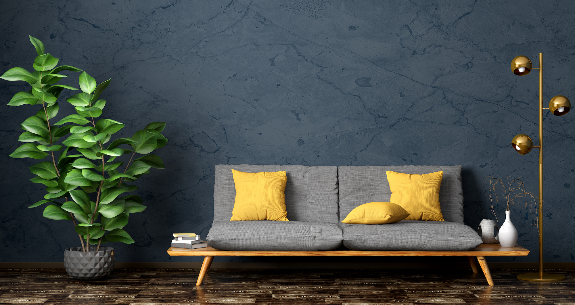
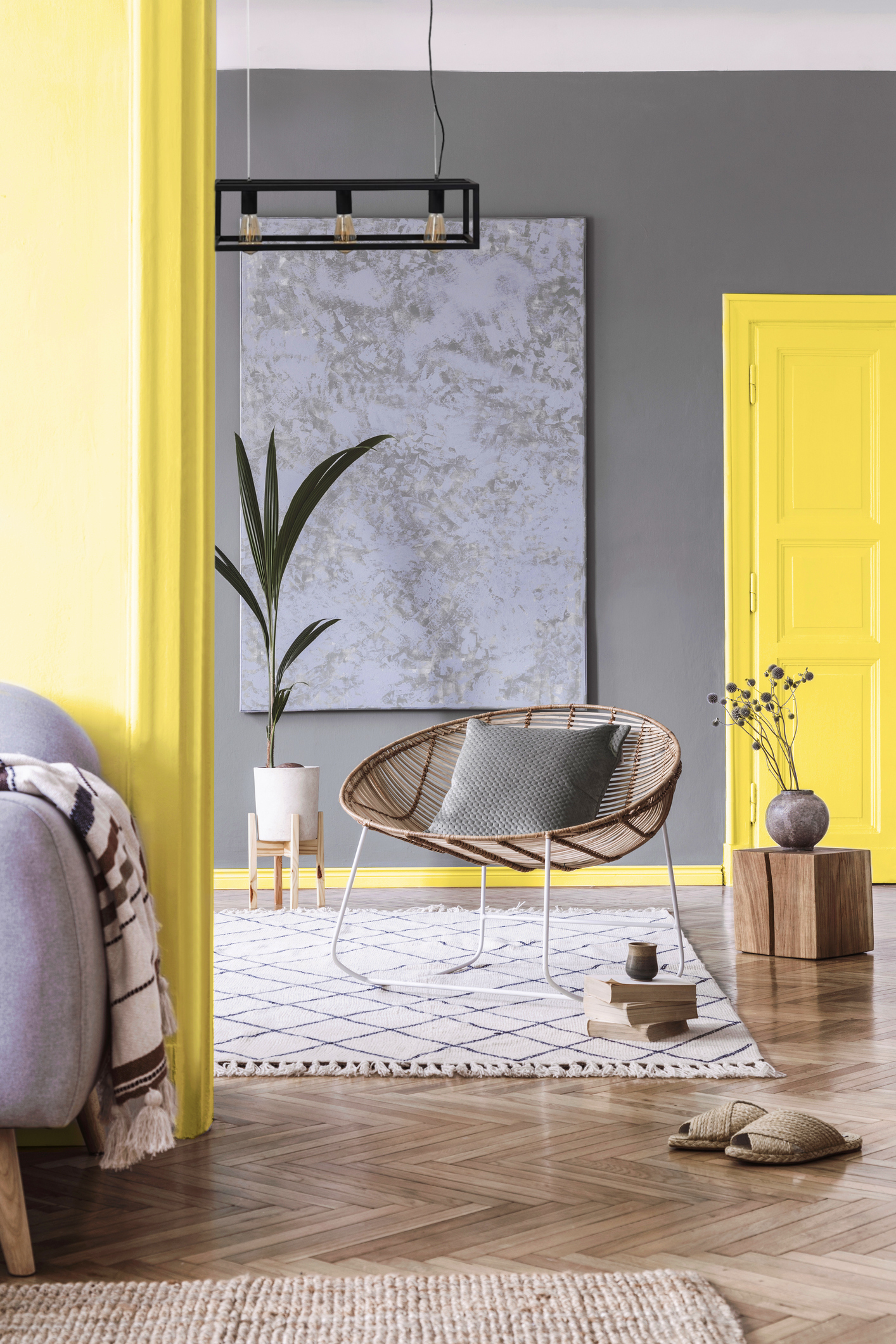
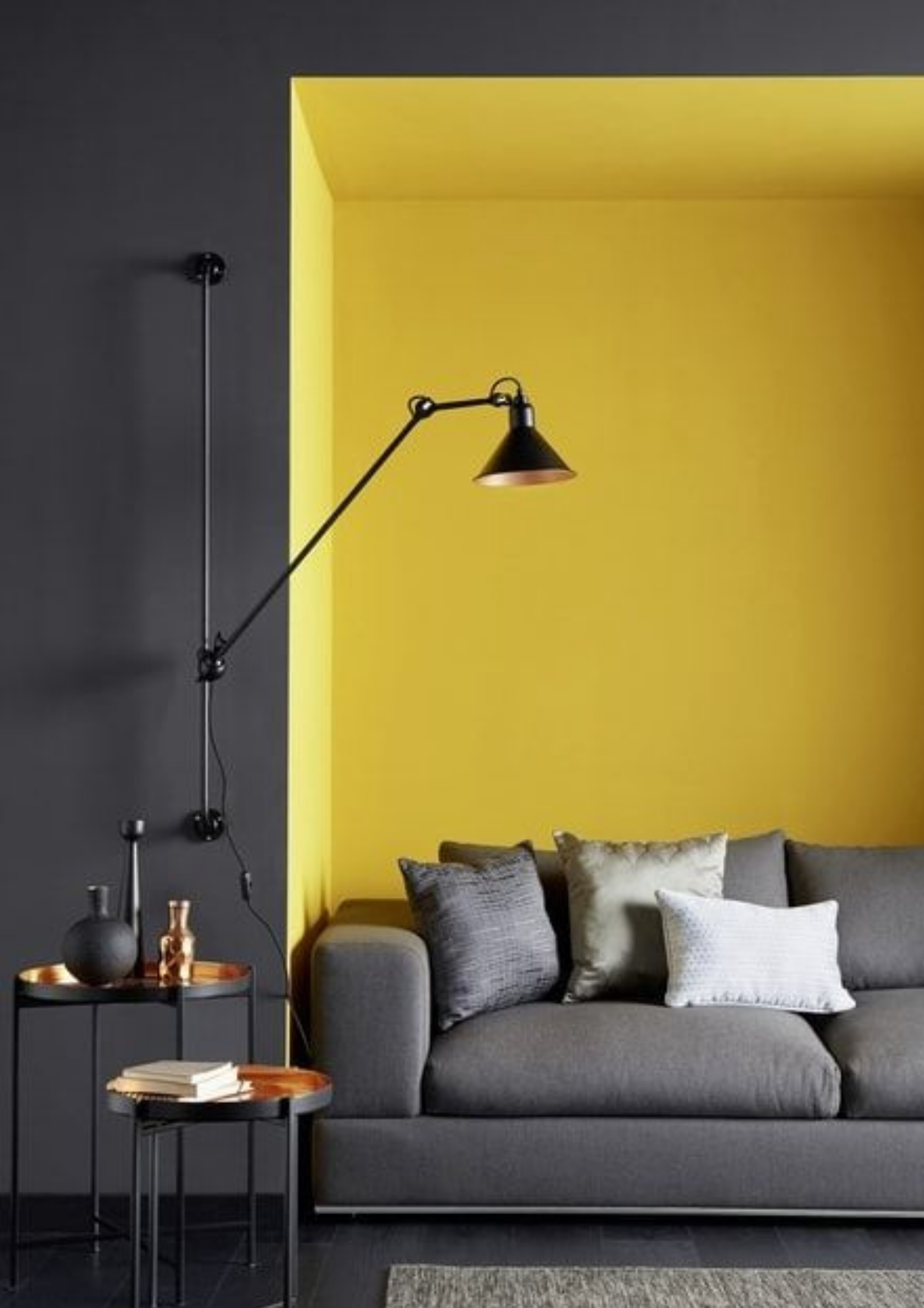
Yellows as bright as Illuminating can feel overwhelming when used on a large scale. Instead, opt for small accents of this mood-boosting colour – they stand out best against a subdued, grey space. It could be a yellow window against a grey wall; a sunny rug on poured concrete; a mink-coloured sofa draped with a mustard throw.

The Interiors Edit
Refresh your living space with our Pantone-inspired edit of statement home accessories, bright updates on timeless furniture and decorating essentials.
Salvage Wallpaper, Cole & Son, £2.50 per sample
Crackle Wallpaper, Cole & Son, £2.50 per sample
Flanna Cushion with Tassels, Shiv Textiles, £70
Togo Fireside by Michel Ducaroy in Alcantara Pearl Grey, Ligne Roset, from £1,488
The Impossible Collection of Design by Frédéric Chambre, Assouline, £695
Citron No. 74, Farrow & Ball, from £49.50
David Bowie in Yellow Suit by Terry O’Neill, V&A Shop, £2,100
David Bowie in Los Angeles by Terry O’Neill, V&A Shop, £2,100
The Lowdown Locker in Mustard, Mustard Made, £249.99
CH24 Wishbone Chair in Beech, Silver Gray and Natural Cord, Hans Wegner for Carl Hansen & Søn, £685
Arrowhead Blanket in Grey Multi, Pendleton, £350
The Baskets in Mustard, Mustard Made, £39
KBG 741 Filter Coffee Machine in Yellow Pepper, Moccamaster, £199
OK Candle in Yellow, CandleHands, £35
Southwark Shelving Unit, Swoon Editions, £199
Original 1227 Giant Floor Lamp in Citrus Yellow, Anglepoise, £2,950
Choc 24cm Frying Pan with Yellow Handle, De Buyer, £35
Bloom Vase in Yellow, Vanessa Mitranni, £425
15 Minute Sand Timer, School of Life, £22
QT-30 Flip Clock in Yellow, TWEMCO, £105
Artículos relacionados
Agora’s Daniela Agnelli on why green is the new black
We speak with Agora co-founder Daniela Agnelli to find out why education is key to saving the planet and why 21st century fashion is less about trends and more about legacy.
Un toque de luz: Las reglas de la iluminación
No hay reglas para diseñar una casa bonita, pero cuando la iluminación, las texturas y los colores pintan el cuadro correcto, es difícil equivocarse, dicen nuestros cinco expertos en diseño.