There’s no rulebook when it comes to designing a beautiful home, but when your lighting, textures and colours paint the right picture, it’s hard to go wrong, say our five design experts.
Dieter Rams enlightened us with 10 principles of good design. Rem Koolhaas laid out the building blocks of his profession in Elements of Architecture. When it comes to interiors, however, design can be more fluid and personal.
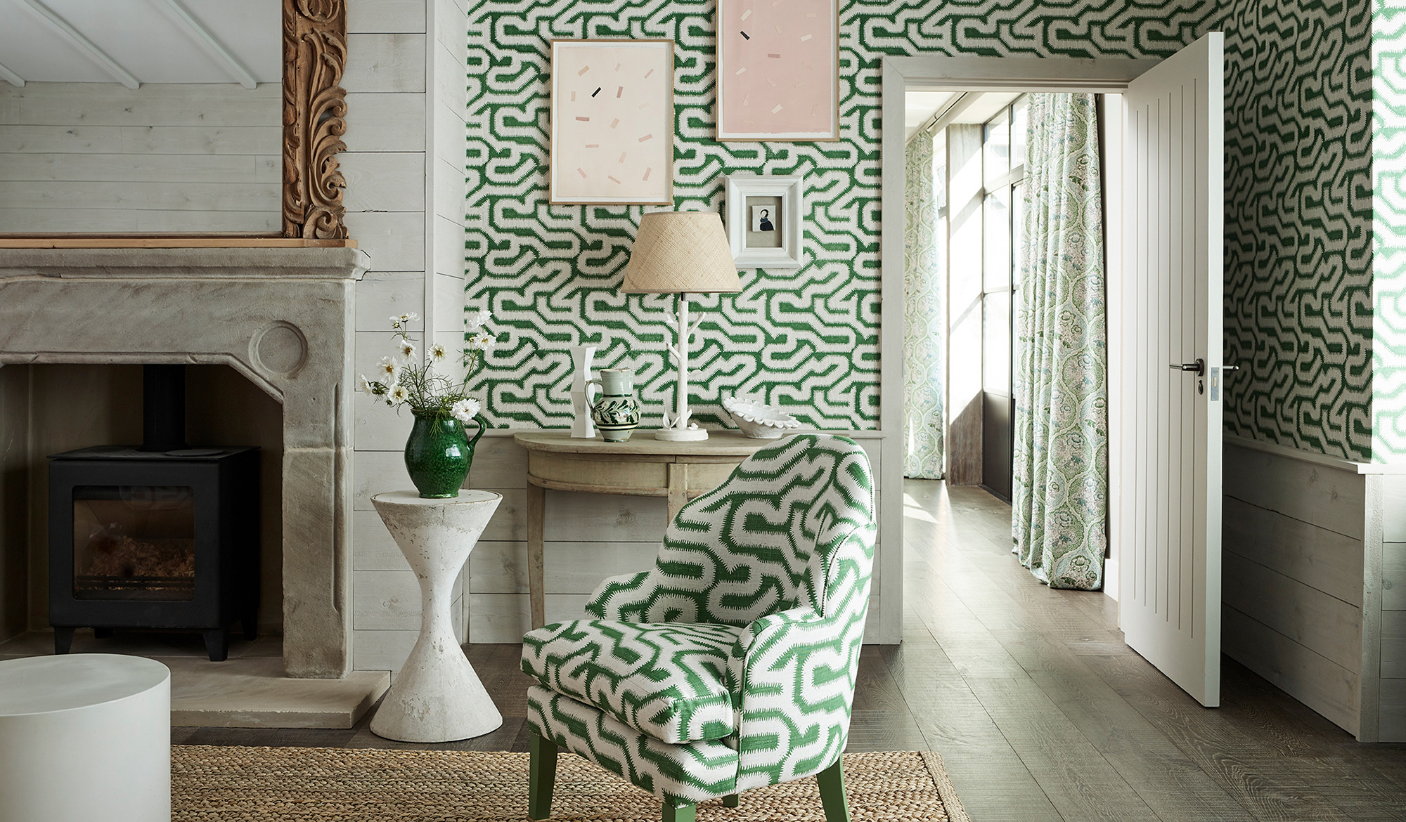
Looking for advice on how to make your interiors look and feel good? Start by harmonising light, texture and colour. Perhaps it’s a feature wall, illuminated in the right places. Or a dramatic lighting fixture accompanied by moody hues and velvet cushions. What matters most is the coherence between these elements, which can transform a dull space into a three-dimensional room.
Rather than ticking boxes and picking decor that you already know you like, consider how they suit the space and the overall aesthetic when they come together – not just within one space but across your entire home. But don’t just take our word for it. We spoke to five design experts about why light, texture and colour matter and how we can get them right.
Lighting
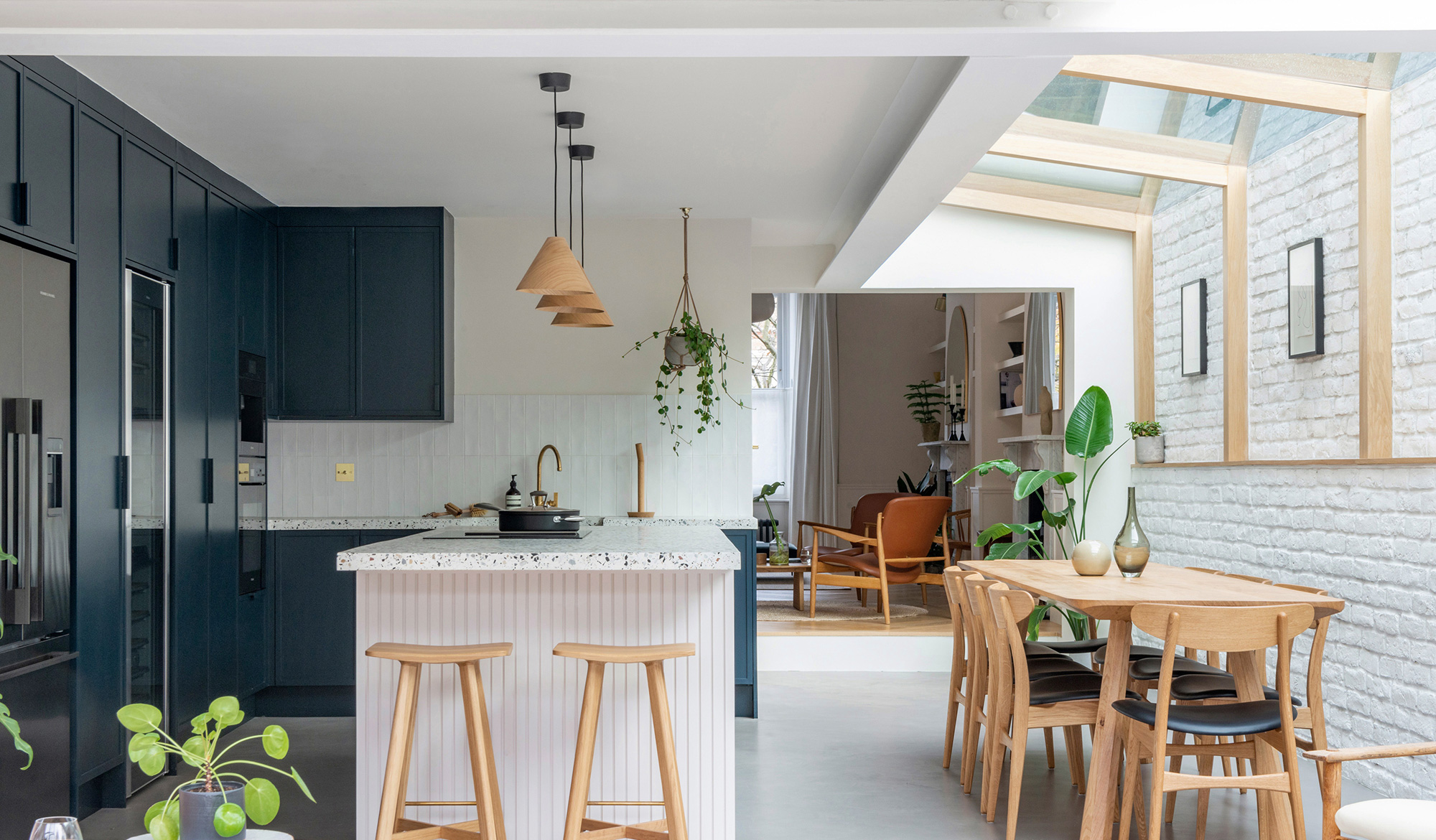
There’s a familiar mood shift when skies turn cloudy and evenings draw out. And it’s during these months that you start to notice how your indoor lights work when sunlight is in short supply. Lighting has the power to make or break a space, yet for many, it remains an afterthought. Far from the functional necessity it once was, lighting can now be dramatic, playful, subtle or the centrepiece of a room: a few minutes browsing Ochre’s collection of sophisticated sculptural installations and you’ll quickly realise that chandeliers can double as art.
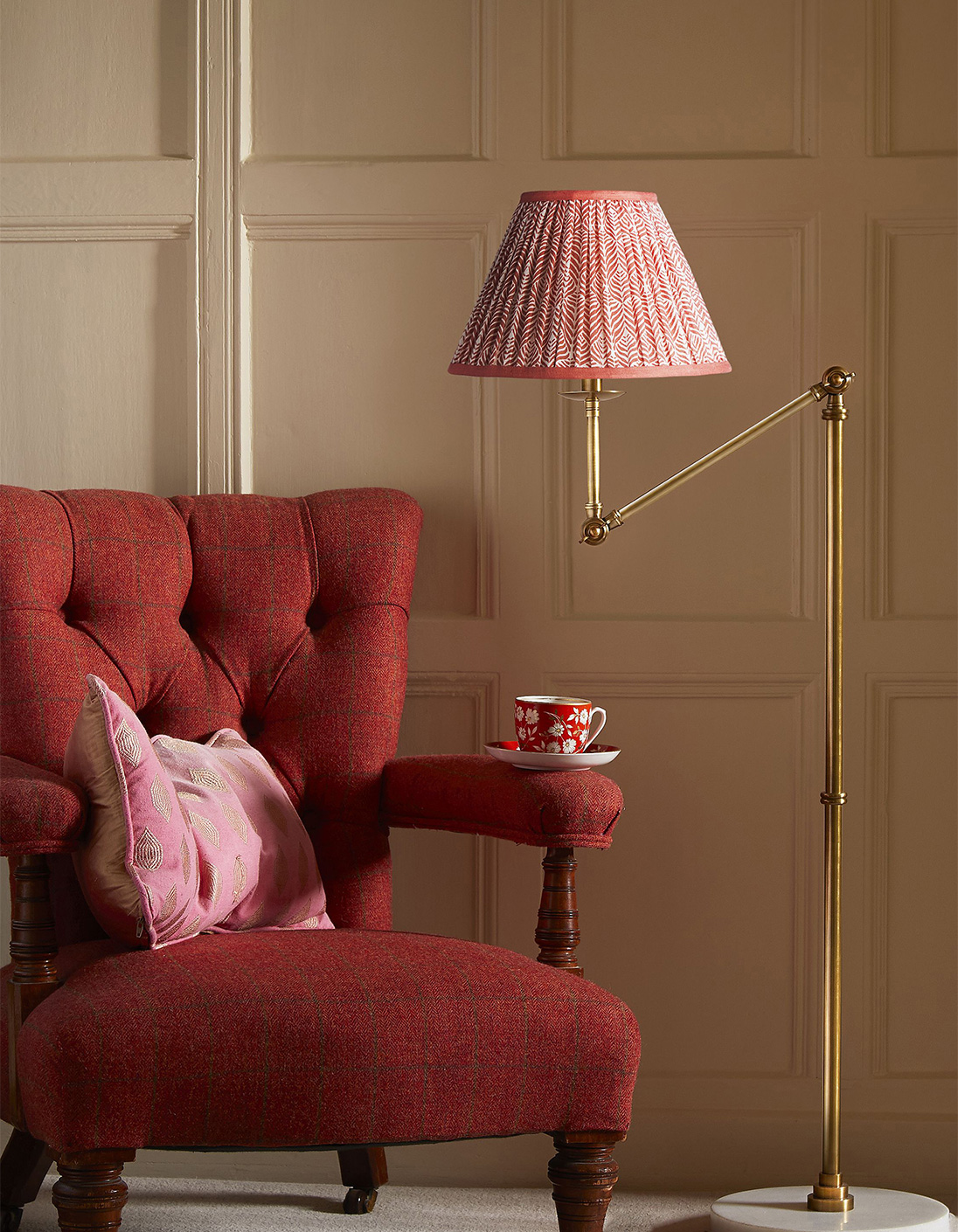
Before deciding what lighting to go for, consider how much natural light the room gets and tailor the warmth of your bulb to the purpose of the space, advises Rohan Blacker. He’s the creative force behind the eclectic lighting design company Pooky, known for its uplifting lamps, colourful shades and elegant pendants. “Areas away from windows need more task lighting so flexible wall fittings paired with your lamp of choice would work best.” Rohan recommends opting for colder lighting – bulbs with a higher Kelvin value – for more functional spaces where we need to focus, such as kitchens and home offices, and warmer bulbs for a more ambient atmosphere. Stick to bulbs that are between 2,700 and 3,200 Kelvin to avoid turning a room orange. Don’t forget candles and log burners too.
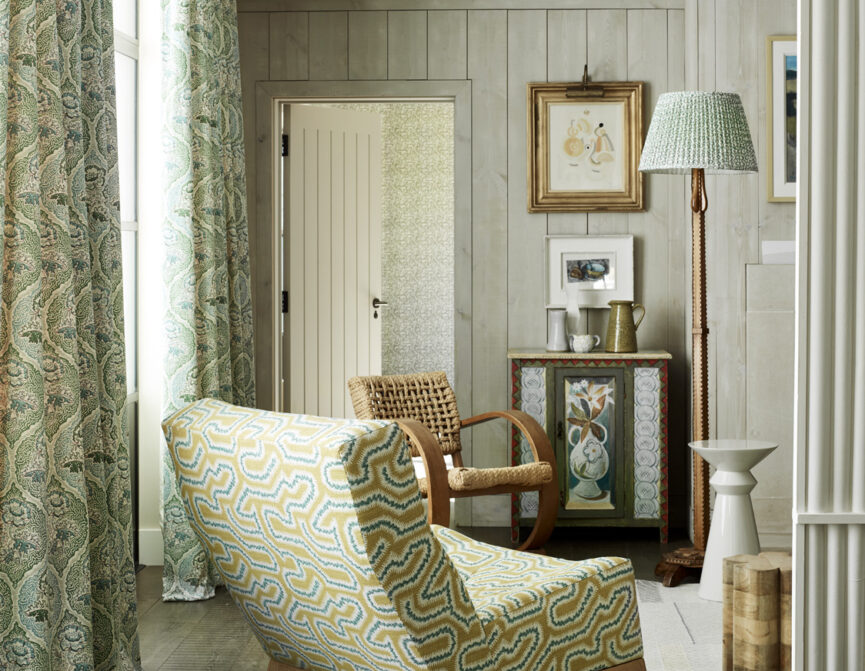
Lighting doesn’t just illuminate dark corners. It can also affect wellbeing. “If it’s too dull or drab it can feel rather oppressive,” says Joanna Bibby, co-founder of Ochre. She recommends using a layered scheme to make the transition from natural to artificial and task to mood lighting seamless. If the space lacks natural light Joanna suggests, “incorporating discreet uplighting or downlighting into the structure of the walls or ceiling, alongside any statement freestanding or pendant pieces.” Don’t underestimate the power of wall lights, nods London-based interior designer Christian Bense, who finds them the best way to emulate natural light because of the direction of their glow – daylight usually washes through from the side too via our windows. Avoid the temptation to flood a small or dark room with artificial light – instead, embrace it and elevate it. “Keep it dark and cosy, maybe adding focused reading lights if need be,” Joanna says, “natural daylight bulbs have their place, perhaps in a home office or on a work desk, but they can emit a rather cold light.”
Localised lamps – be they overhead, table or floor – and dimmers are useful ways to build an efficient, adaptable and layered scheme, according to Rohan. The more sources of light you have, the greater the variety of moods you can create. “Try clustering a few lamps to add impact to an alcove or mantelpiece. If you have the space, use pairs of lamps to create some formality and to frame pieces of furniture or art.” The key to a successful lighting scheme, Rohan reveals, is planning it from the onset and installing dimmers to most of your circuits.
While hasty decisions on your home lighting scheme might manifest in headaches, fatigue and tiredness, Christian points to its effects on the cohesiveness between spaces too. “Usually, people design the lighting by treating each room as an isolated space without much thought for how they link and interact,” he notes. To make your home feel interconnected, each room should effortlessly flow into the next. Practicality is central to the overall placement of your fixtures – changing sockets might not be an option – but Christian urges us to consider the bigger picture.sources of illumination will look as a whole and how it serves the purpose of the room.
Materials
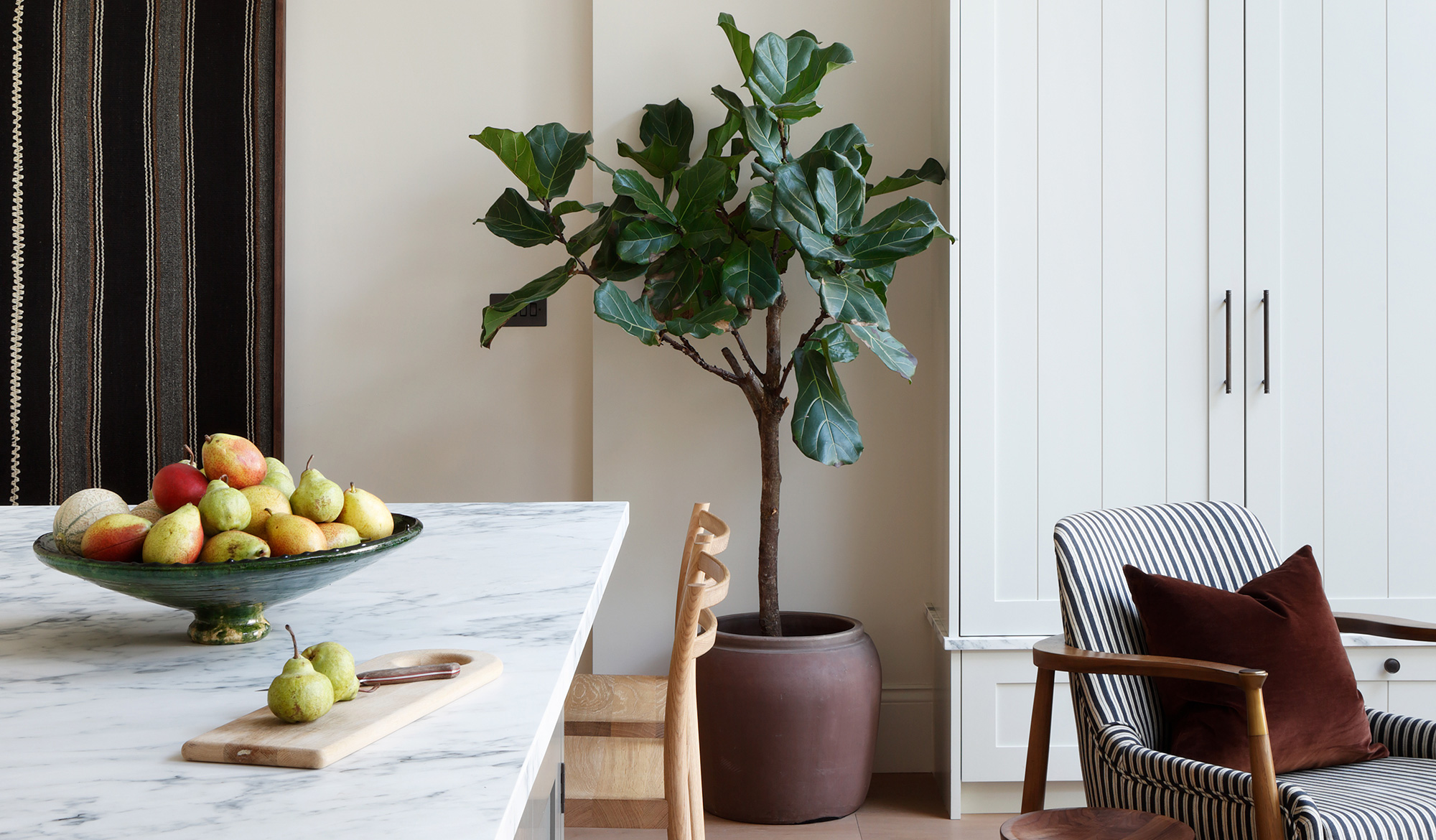
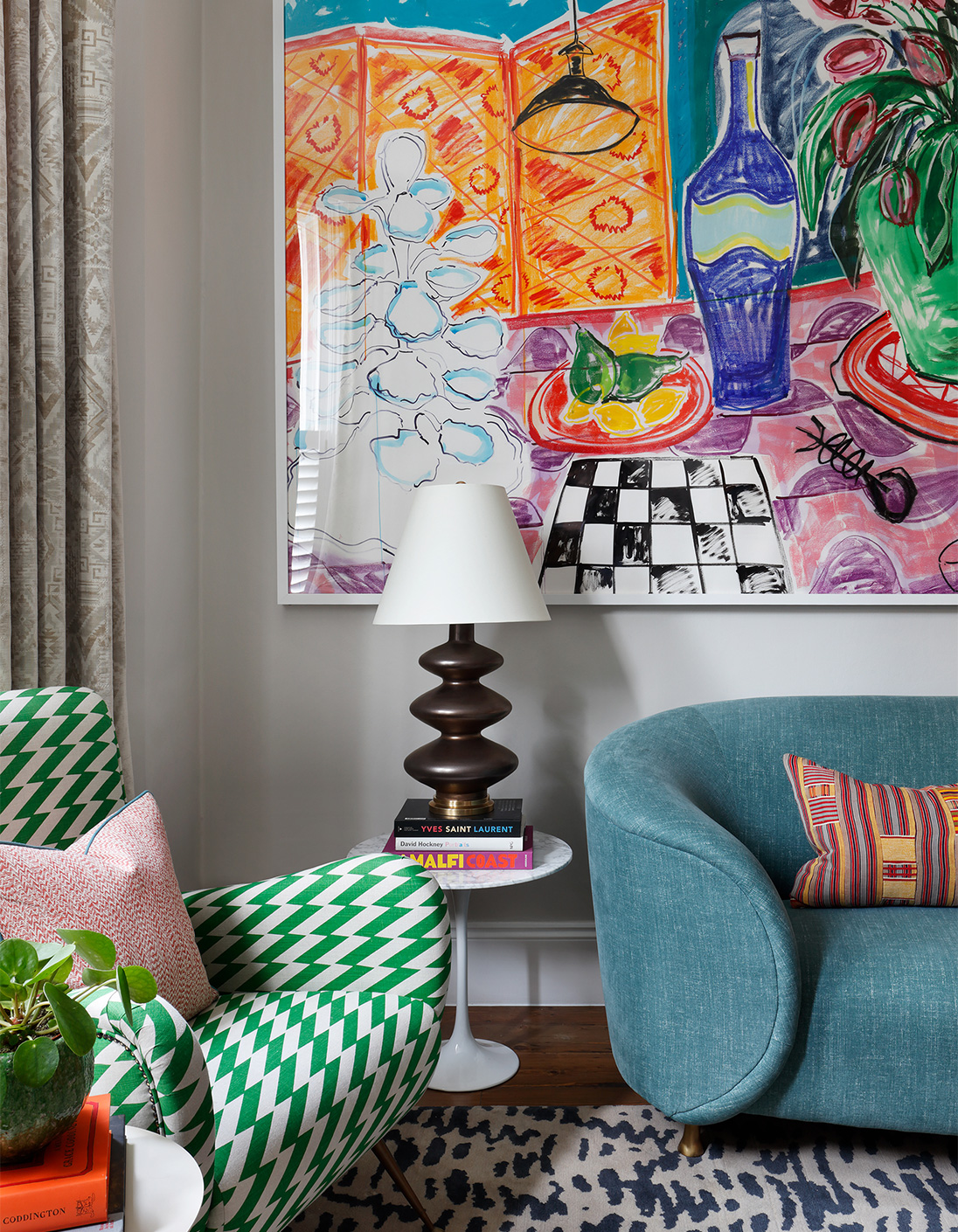
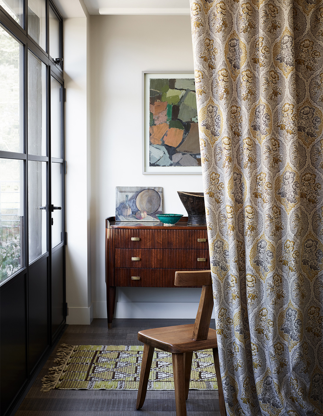
There’s an undeniable feeling of comfort that comes from running your fingers along the grooves of a wooden table, sinking into soft cushions or feeling the threads of a carpet under your bare feet. Texture has become woven into the vernacular of interior design – quite literally. “Materials and textures are what gives depth to a space: they help make interiors feel warm and homely,” explains Stephen Nash, founder of ALL & NXTHING, an interior design studio known for their idiosyncratic spaces. Without them, a room will seem flat and one-dimensional, but incorporating texture isn’t as simple as throwing a fringed cushion or a velvet sofa into the mix. Achieving the right balance of materials ties a space together and adds visual interest. “Materials and texture are just as much about what the eye sees as what the hand feels,” Christian notes. Yes, touch and physical texture are crucial but the visual relationship between the accessories in a room shouldn’t be overlooked. Contrasting fabrics are one way of adding visual weight to a room – Christian’s project near Wandsworth included materials such as leather, velvet, linen, painted finishes and metal to curate a living room that
was neutral in colour but rich in tactility. A luxurious blue sofa next to a sophisticated leather fender. Smooth walls elevated by a bespoke map.
A well-designed space should achieve a balance between materials that both stimulate and soothe the senses. Touch is an undervalued sense according to Peter Thwaites, the co-founder of artisan wallpaper and fabric design company Rapture & Wright. Comforting textures relax mind and body, particularly plush materials. “Walking or sitting on materials such as soft and tactile rugs can improve physical wellbeing because the feet have important pressure points,” Peter says. While fabrics are calming to touch and offer an easy way of bringing colour and pattern into your interiors, they’re also great for softening sound and light. Try layering different materials and blending sources of texture, whether that’s through surfaces or accessories.
As our connection with the environment grows, organic and sustainable materials are very much at the forefront of current conversations about sustainability and the need to reduce our carbon footprint. Increasingly, we’re seeing furniture and homeware that celebrate these natural textures. Stephen adds: “One of our favourite materials is cork, a natural tree bark harvested without harming the plant. It is then regrown, allowing it to be used repeatedly.”
Perhaps, Stephen ponders, this has to do with the recent shift toward the acceptance of flawed beauty and transience – a sentiment that forms the foundation of the Japanese philosophy of wabi-sabi and its extension, Kintsugi. Both reject the modern world’s demand for perfection and instead focus on authenticity and meaning, forgoing mass-produced furnishings in favour of vintage wares or antique pieces. “We are becoming increasingly mindful of consumption and choosing to mend or buy second-hand rather than buying new; this is a more sustainable approach to interiors, as well as helping to create more individuality in our spaces,” Stephen explains.
Christian is also an advocate of organic materials. For him, their inherent imperfections disrupt the monotony of man-made finishes – he recommends starting with something simple such as a side table. They are seemingly insignificant, but even just one can make all the difference to a room. There’s an appetite for furnishings that have a story and Christian believes that this interest in how products are made enhances the enjoyment of the piece itself.
‘We are becoming increasingly mindful of consumption and choosing to mend or buy second hand rather than buying new.’
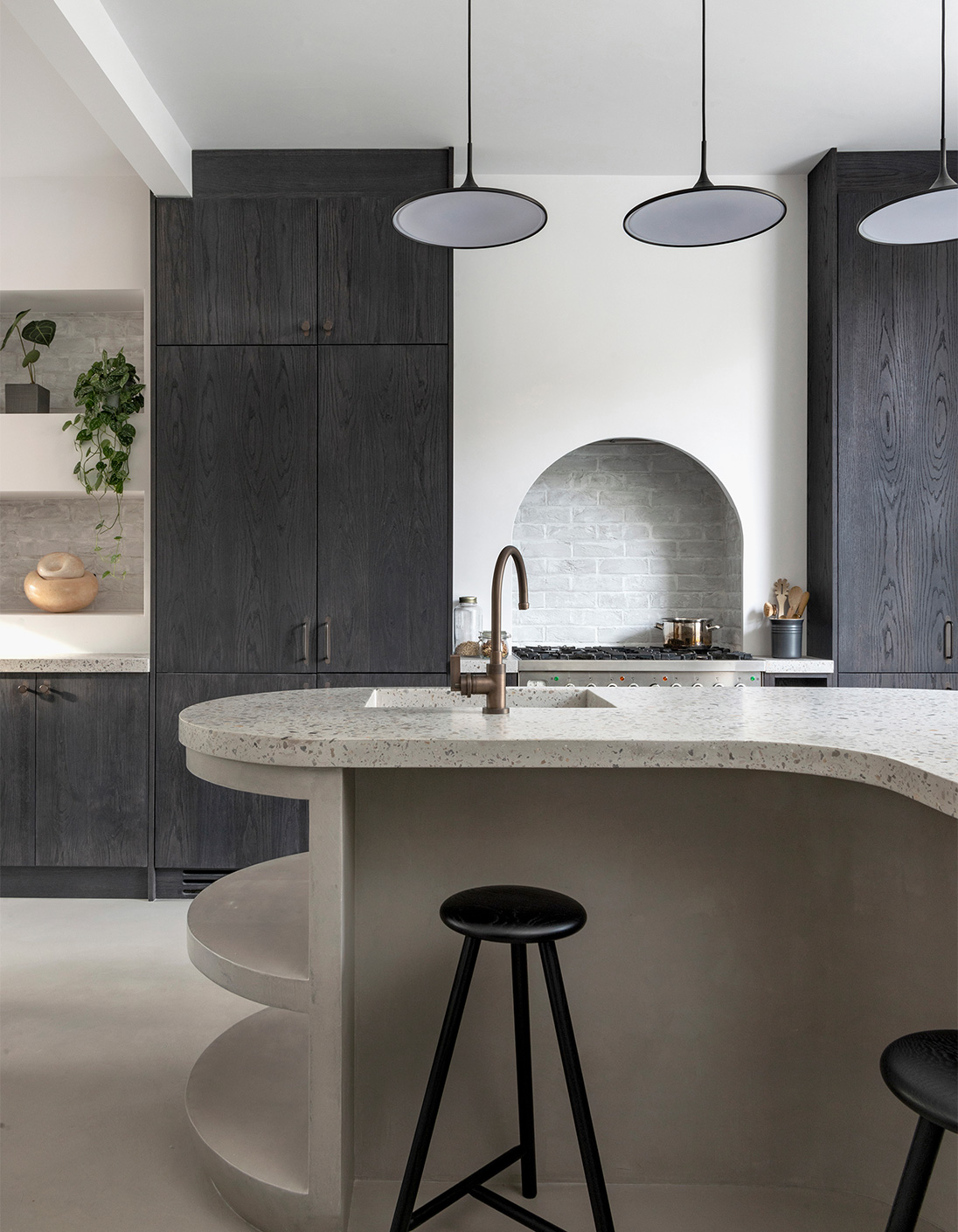
Colour
It’s a well-known fact that colours are closely linked to our moods: red, yellow and blue – most primary colours have connotations that our mind automatically relates to emotions. It’s why we intuitively respond to brightly-painted or highly patterned spaces – colour psychology changes the way we experience a room. “I often use the example of giving a speech when talking about colour and pattern,” Christian says. “Just like important moments in a speech where perhaps you would pause, change your tone or pace, colour and pattern are the moments when we add interest and make a statement”.
Bold hues and motifs have grown in popularity recently and are set to adorn the walls of many more homes this year – Pantone’s colour of the year, for example, is Very Peri; a revitalising blue with a violet-red undertone. Primary colours are energising, Peter points out, while dark, rich, earthy or contrasting colours are relaxing. This doesn’t mean you need to coat your walls scarlet however. Instead, Peter suggests introducing strongly coloured or lacquered pieces of furniture into a scheme. “A subtle way to weave in colour and create interest is to put a coloured glass or leather top on a wooden piece of furniture such as a desk or sideboard”.
When it comes to motifs, simple graphic patterns can make a space feel more contemporary and act as the perfect foil for traditional pieces of furniture. Finishes matter too, Peter notes. Matte and colours that absorb light can be calming, while shiny or gloss finishes can appear luxuriously modern. One important consideration to mull over is the environmental impact of your choices. “Limewash paints are growing in popularity because of their deep, textural surface and naturally solvent-free composition, making them the more environmentally-friendly choice. Other eco-paints are also on the rise as consumers increasingly prioritise environmental impact,” Peter says.
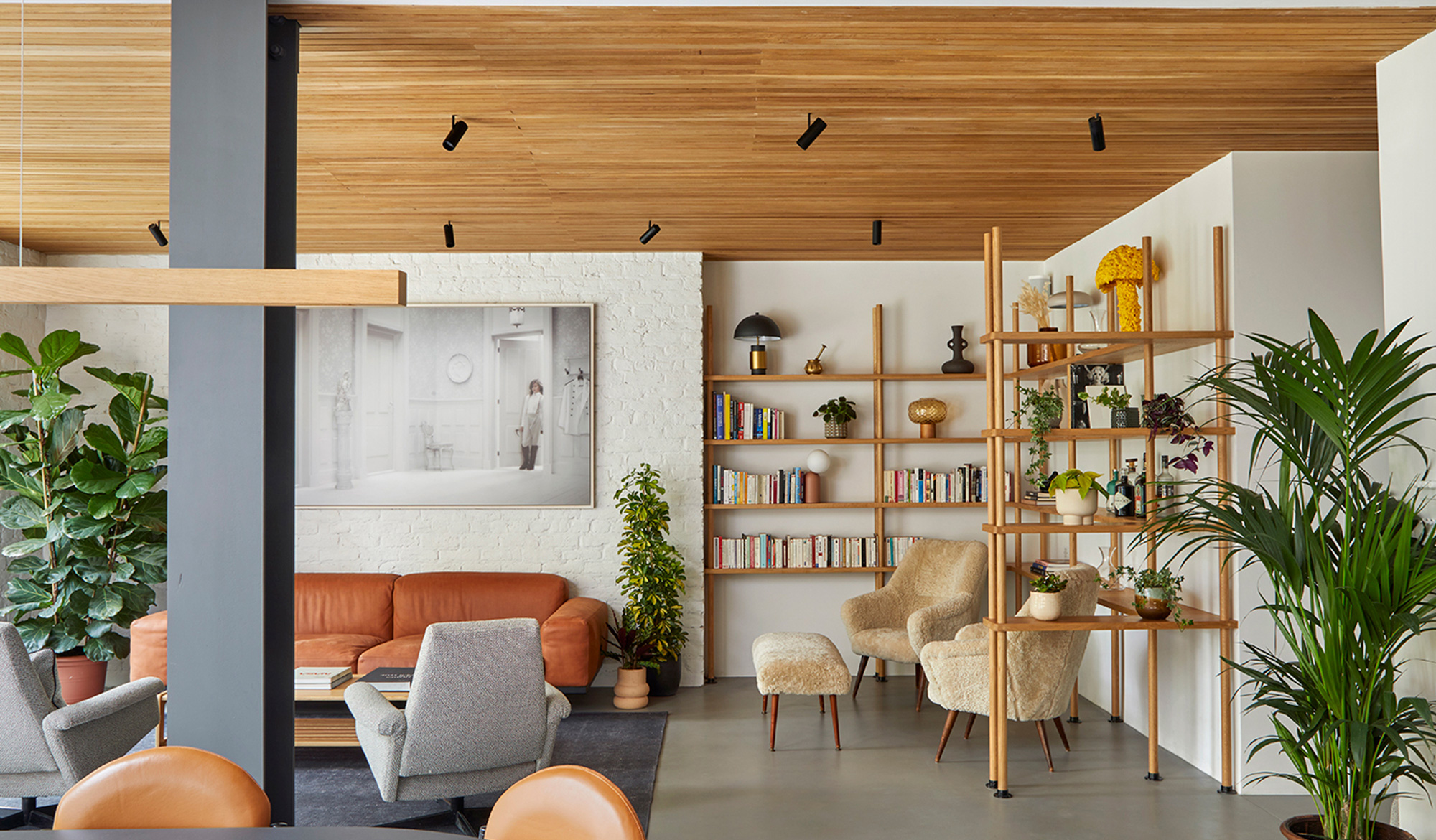
Pared-back hues shouldn’t be forgotten either. “We like to use soft colours and gently pigmented shades of white to give some depth and personality while maintaining a sense of calm,” Stephen says. White, for example, can look sophisticated, reflect light and visually amplify the scale of a room. Take a look at ALL & NXTHING’s Parkhill project where a hushed paint palette, off-white furnishings and natural wood amplify the sense of tranquillity in this Belsize Park apartment.
Before choosing your colour scheme or finishes, make sure you test the paint colours and compare how they look during different times of the day and in different parts of the room. They might not live up to expectations under an incandescent lightbulb or low lighting. If you’ve got a relatively small area, don’t be afraid of using dramatic colours or bold patterns either. On the contrary, Peter is an advocate of using them to play with the perceived proportions of a space – larger patterns will add volume to a room. “Confidence can be an issue making these decisions, but nothing is irreversible.”
Importantly, don’t underestimate floors and artwork as a vehicle for vibrant motifs and hues – they can anchor or act as a catalyst for the overall aesthetic. “Artwork, objets d’art and accessories can subtly introduce colour and have the benefit of being flexible, meaning so they can be moved around as desired,” Stephen emphasises. Rohan agrees that incorporating pops of colour, expressive patterns and playful textures into your spaces can convey a sense of individuality and character into your home, whether that’s through a printed lampshade, eye-catching lamp base or quirky pendant.
Above all, our homes are a reflection of ourselves and our tastes. Our interiors become the stage for our everyday lives and, by creating synergy between light, texture and colour, you can achieve a backdrop that is as beautiful as it is functional.
allandnxthing.com | @allandnxthing
christianbense.com | @christian_bense
ochre.net | @ochreochre
pooky.com | @pookylights
raptureandwright.co.uk | @raptureandwright
Related Articles
All & Nxthing
A synthesis of contemporary and reclaimed styles, All & Nxthing offer character and comfort in every interior project.
Rapture & Wright
Rapture and Wright satisfy today’s preference for the bespoke, using artisanal methods to create high quality pieces.